# OmniBrowser GuideBook
# 1. Intruduction
OmniBrowser is a powerful web-based platform, which focuses on single-cell data exploration. Here you have the authority to access to the continuously updated comprehensive single-cell database. It provides flexible data retrieval system, interactive data visualization, and cutting-edge analysis. What is more, all these functions are command-line free! The software allows scientific and clinical users, even ones without programming experience, to quickly investigate massive amounts of single-cell data.
# 2. Login Page
Welcome to the Home Page of OmniBrowser, if you are new users, please click on the Get Started button to begin with registering a 15 days free trial account. The trial account can access and unlock certain number of datasets for free. To access more datasets, a purchase can be made following the introduction on the page, or contact our BD department for more information.
If you already registered or have an account, please click the login button to enter the OmniBrowser.

After login, you are on the dashboard page. The toolbar on the left side, there are some buttons which are: Plot Theme, Save Report, Update List, Help, FAQ, Feedback, Reset Password and Logout in turn.
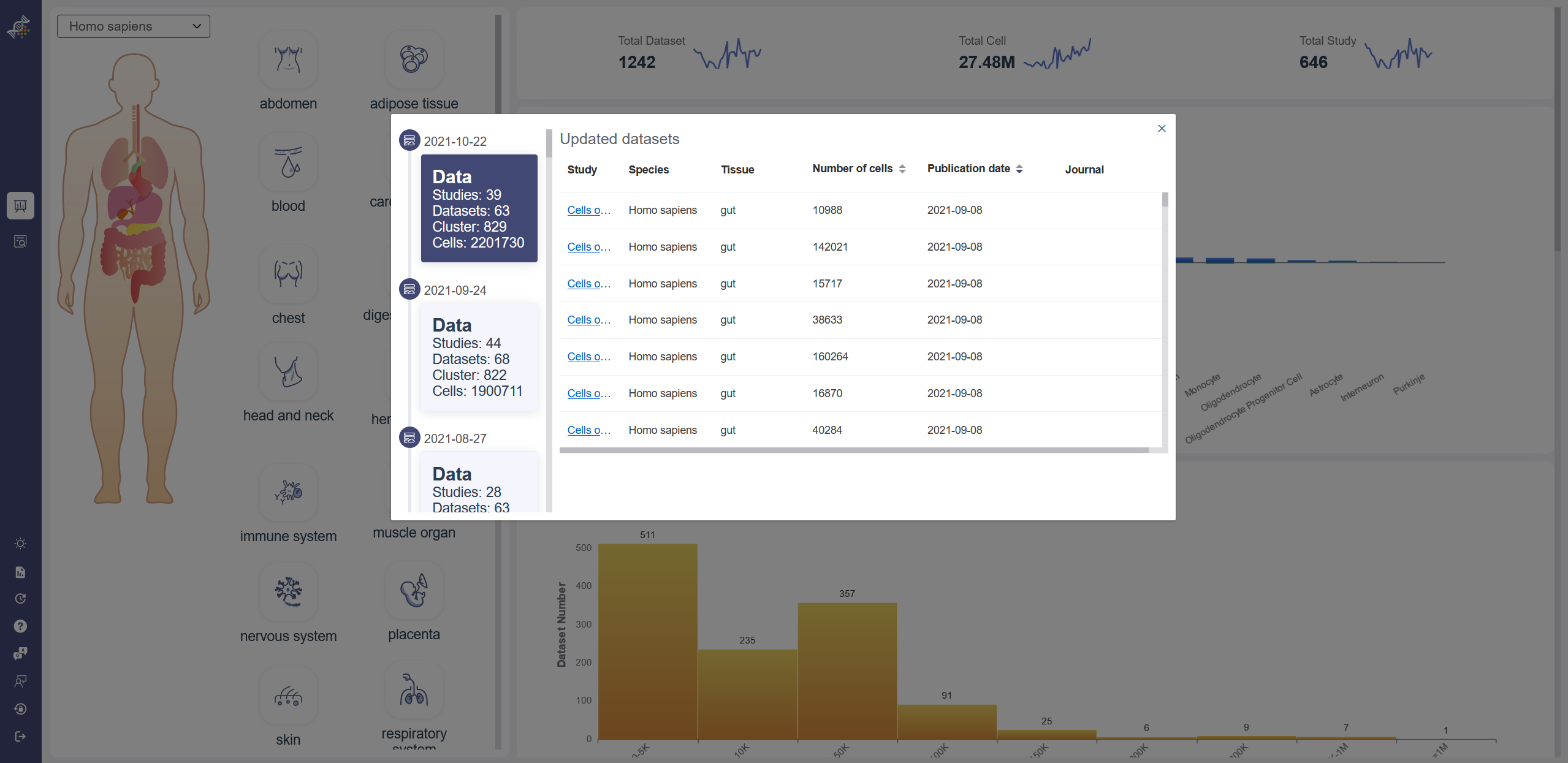
Update List: Click on Update List icon to show data and function update list. The link in study column will bring you to the Load Dataset page of the corresponding dataset. Help: Click on Help icon to check the OmniBrowser GuideBook. FAQ: Click on FAQ icon to see requently asked questions and answers. Feedback: Click on Feedback icon to send your feedback on any aspect of OmniBrowser to us. Reset Password: Click on Reset Password icon to reset the password of your account. Logout: Click on Logout icon to logout of the current account.
# 3. Search
OmniBrowser provides the multi-dimension and multi-angle search strategy to retrieve the dataset efficiently. There are SUMMARY function and search function. In the SUMMARY function, there is the aggregated data information of the whole database. For the search function, there are common search and advanced search, common search provides the different parameters to search the data more quickly; advanced search supports AND/OR logical operation to get the data more precisely.
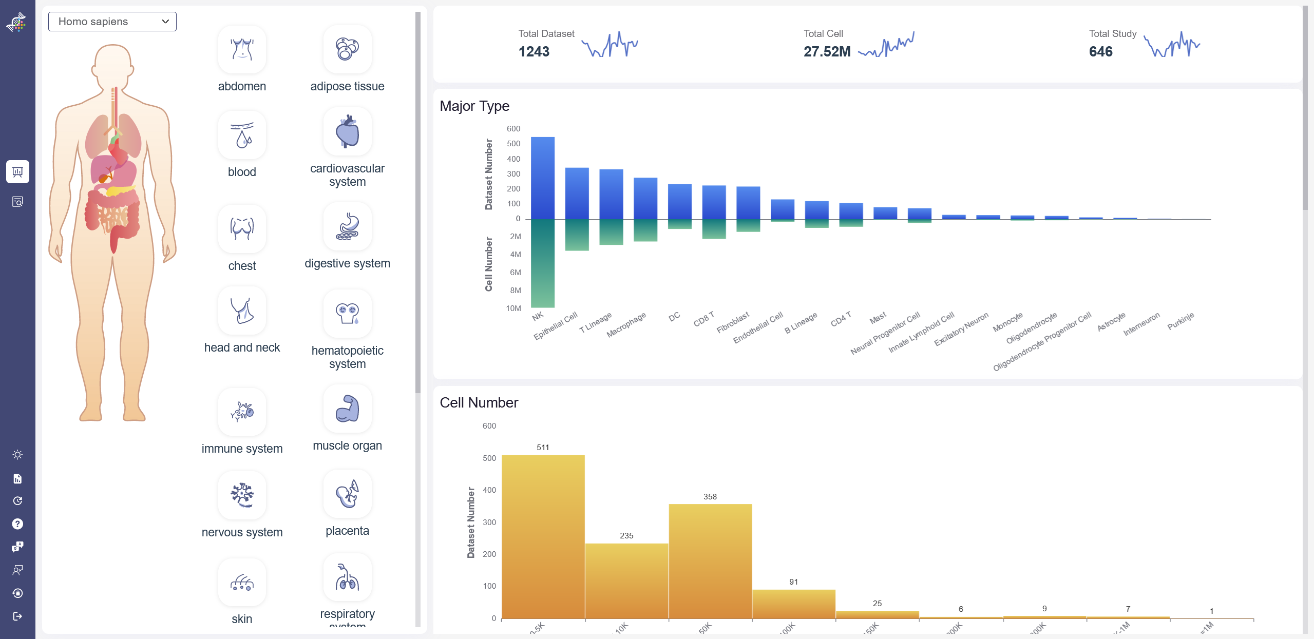
# 3.1 Dashboard (Statistic)
On dashboard, the statistics of curated data are visualized according to different species and tissues. On the left part, the different species and tissue can be selected, once the icons are clicked on, the corresponding aggregated data can be showed on the right part. For example, the research topic number, cell number and the total number of the datasets. After the dashboard icon on the left is clicked on, the filtered datasets can be checked when the search button is clicked.
# 3.2 Search Studies(List)
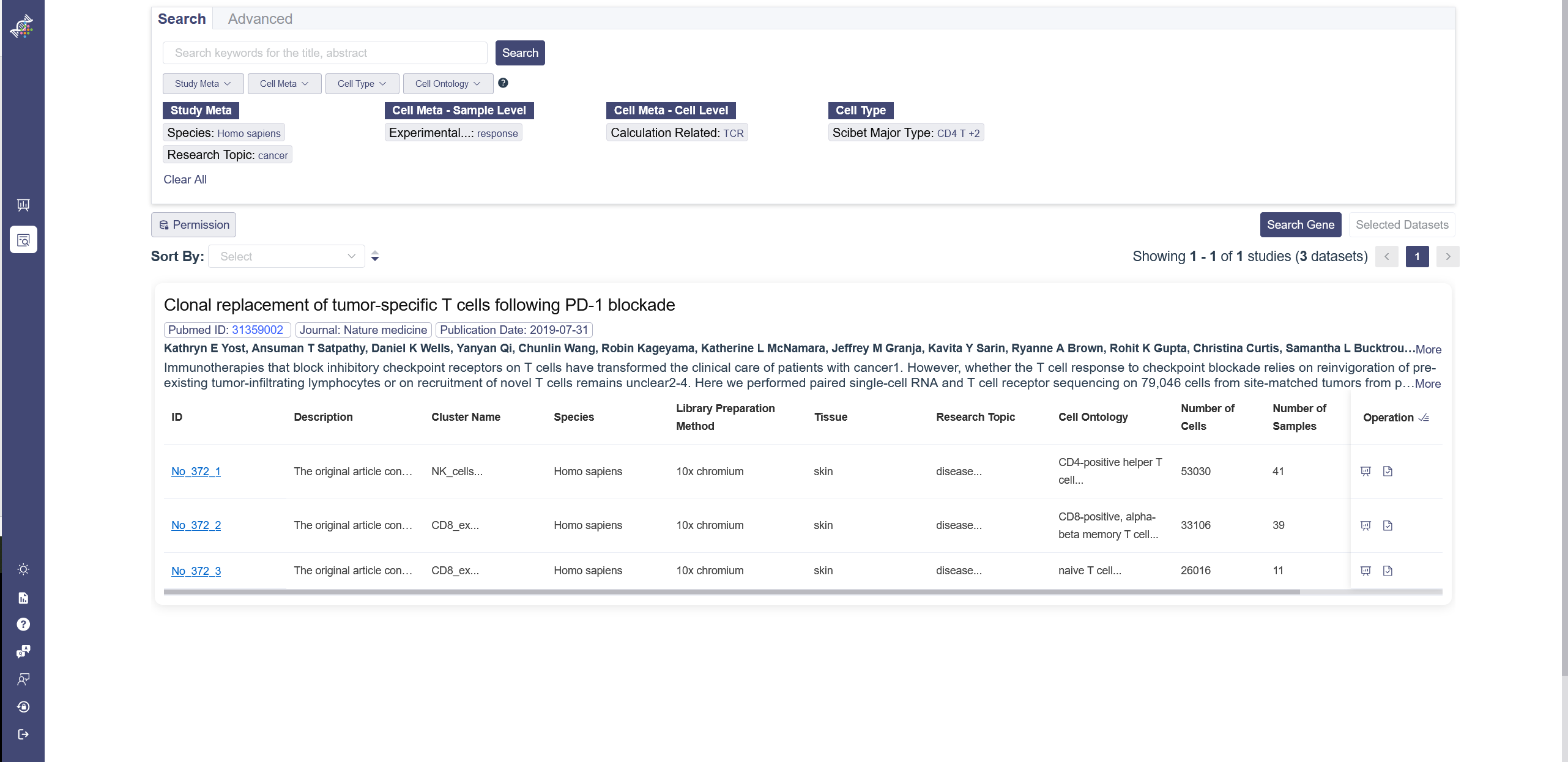
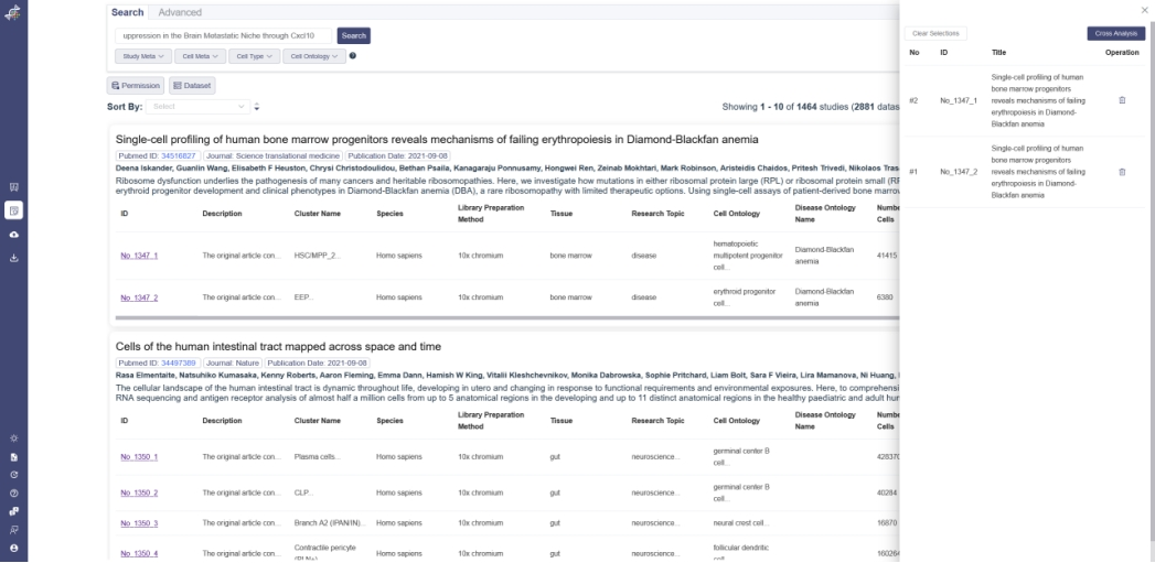
In the search page, the upper part is the search function area, there are common search and advanced search tabs. Below the search function area is the result area.
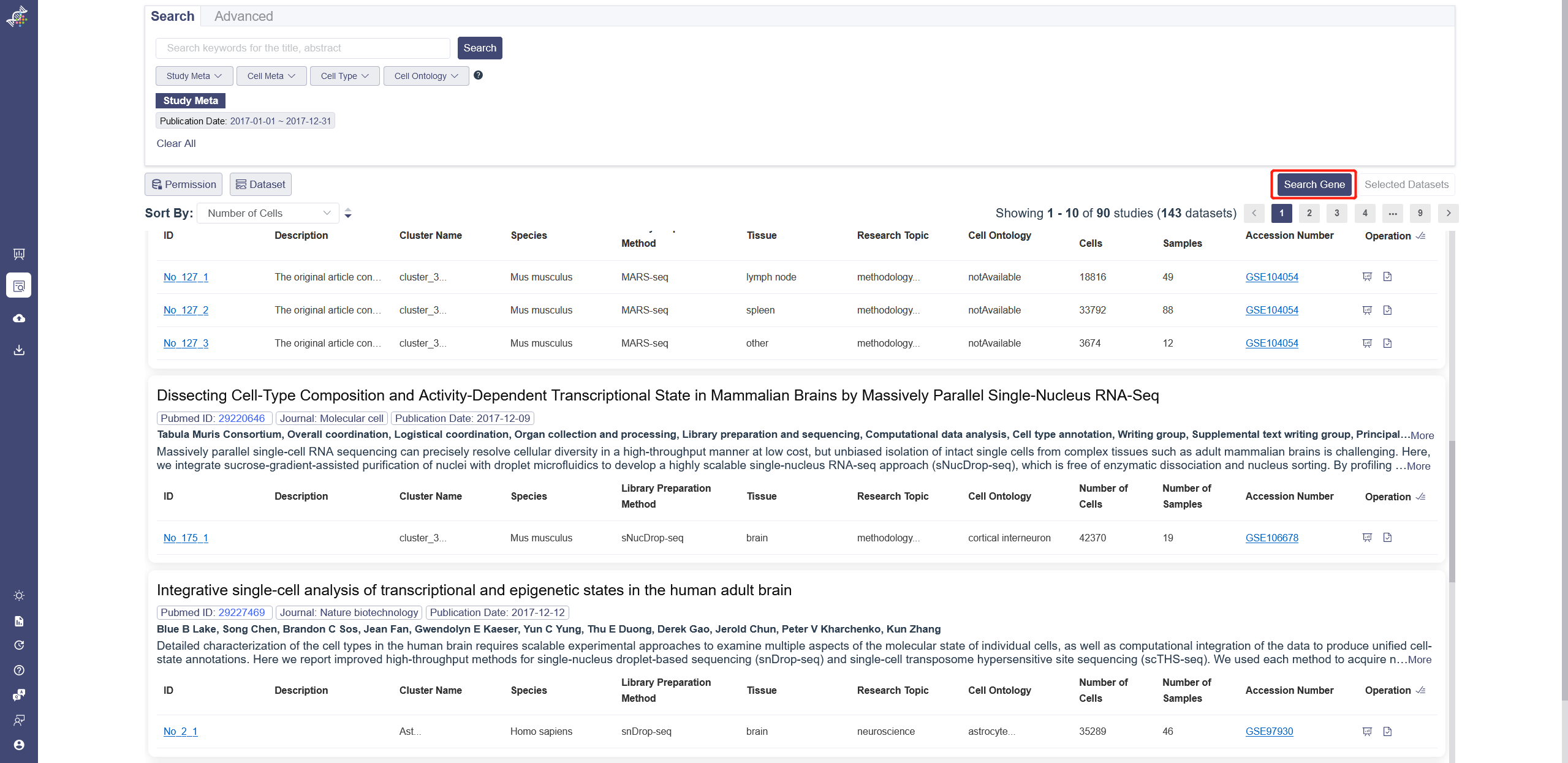
# 3.2.1 Common Search
You can input the keywords in the search bar for title abstract as the filter to retrieve studies. There are four drop-down list, which the particular parameters can be chosen as filters to retrieve the datasets. There is a search rules notification on the right to view. It illustrates the search rules’ difference between the category level filters and inner category level filters. Apply button needs to be clicked after selecting in one drop-down list, and Clear button is used to remove the chosen parameters.
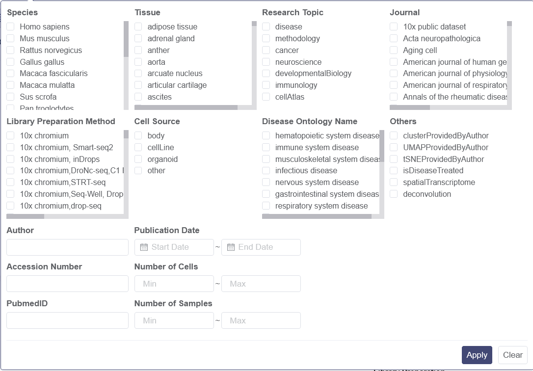
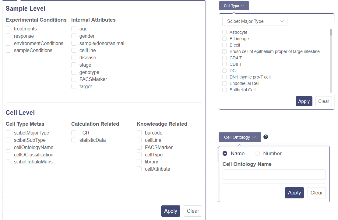
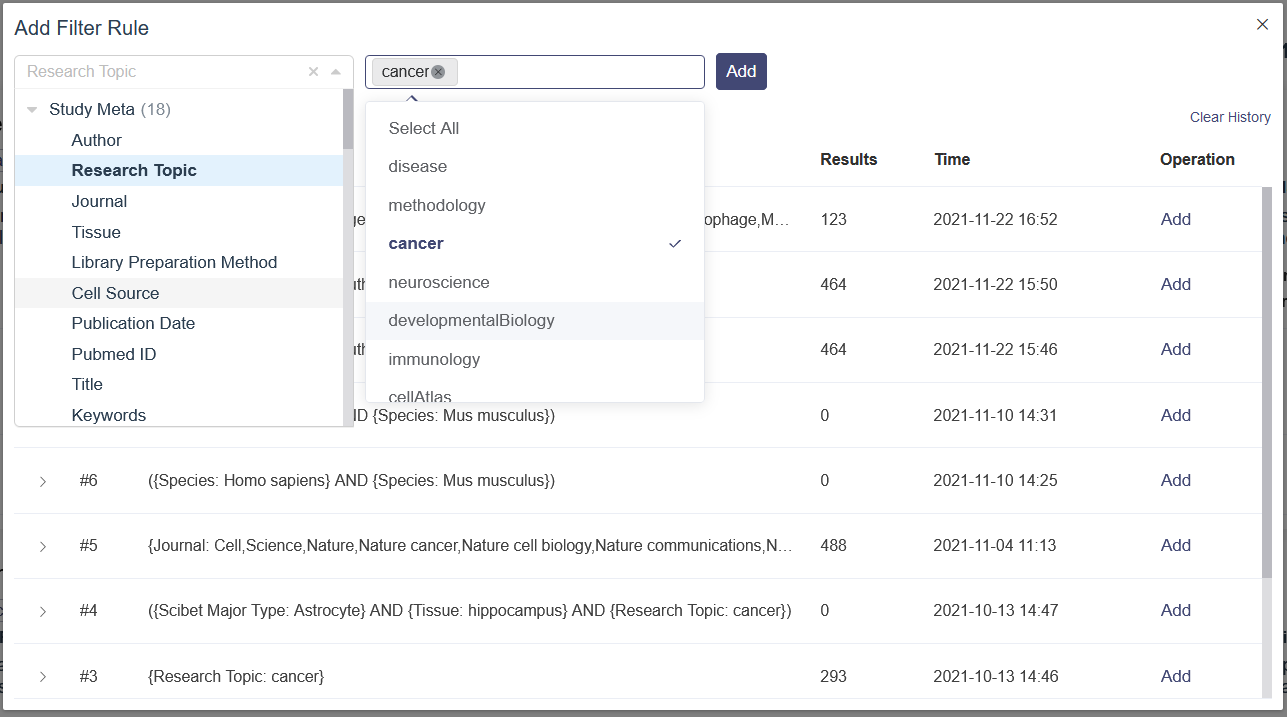
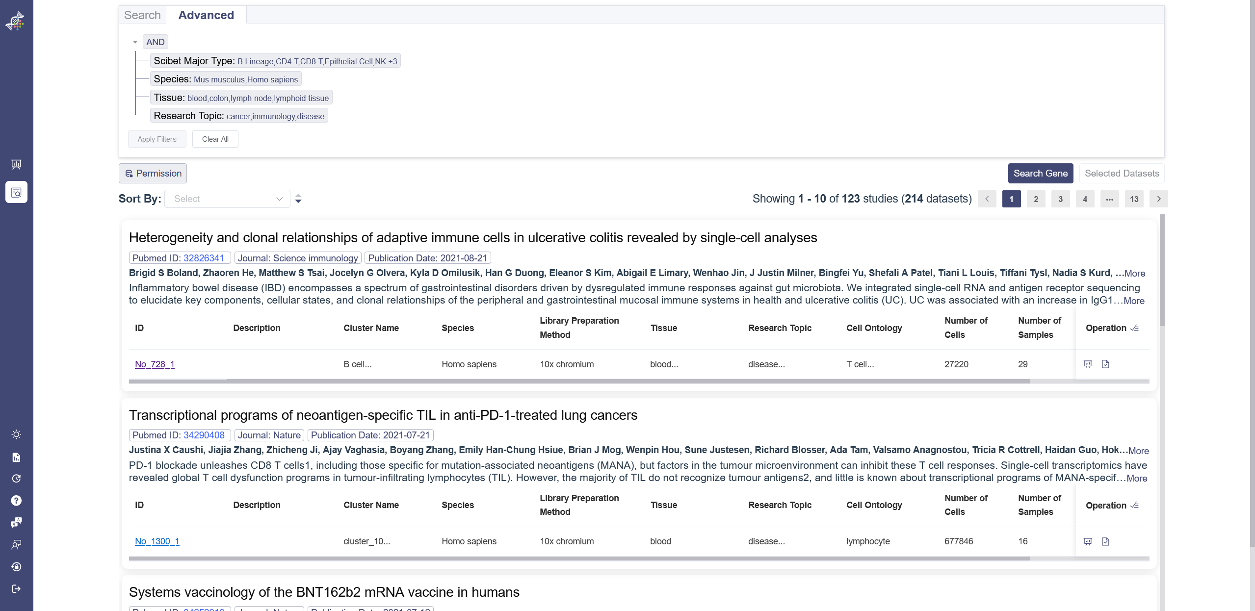
# 3.2.2 Advanced Search
Advanced search provides a flexible search strategy to get a more detailed and customized search result. And There are two sub functions can be used in this tab: (1) Add Filter Rule: This sub function is used to add exact parameters to search filter, which means the parameter can be selected and the parameter’s value can be selected also. (2) Add Join Group: AND/OR logic operation can be used in this function. There are multiple parameters and value can be selected, and based on the logic operation, different search filter combination can be created. After inputting the select filter, click on Apply Filters button can be used to search or Clear All to remove all the selected parameters.

# 3.2.3 Filters
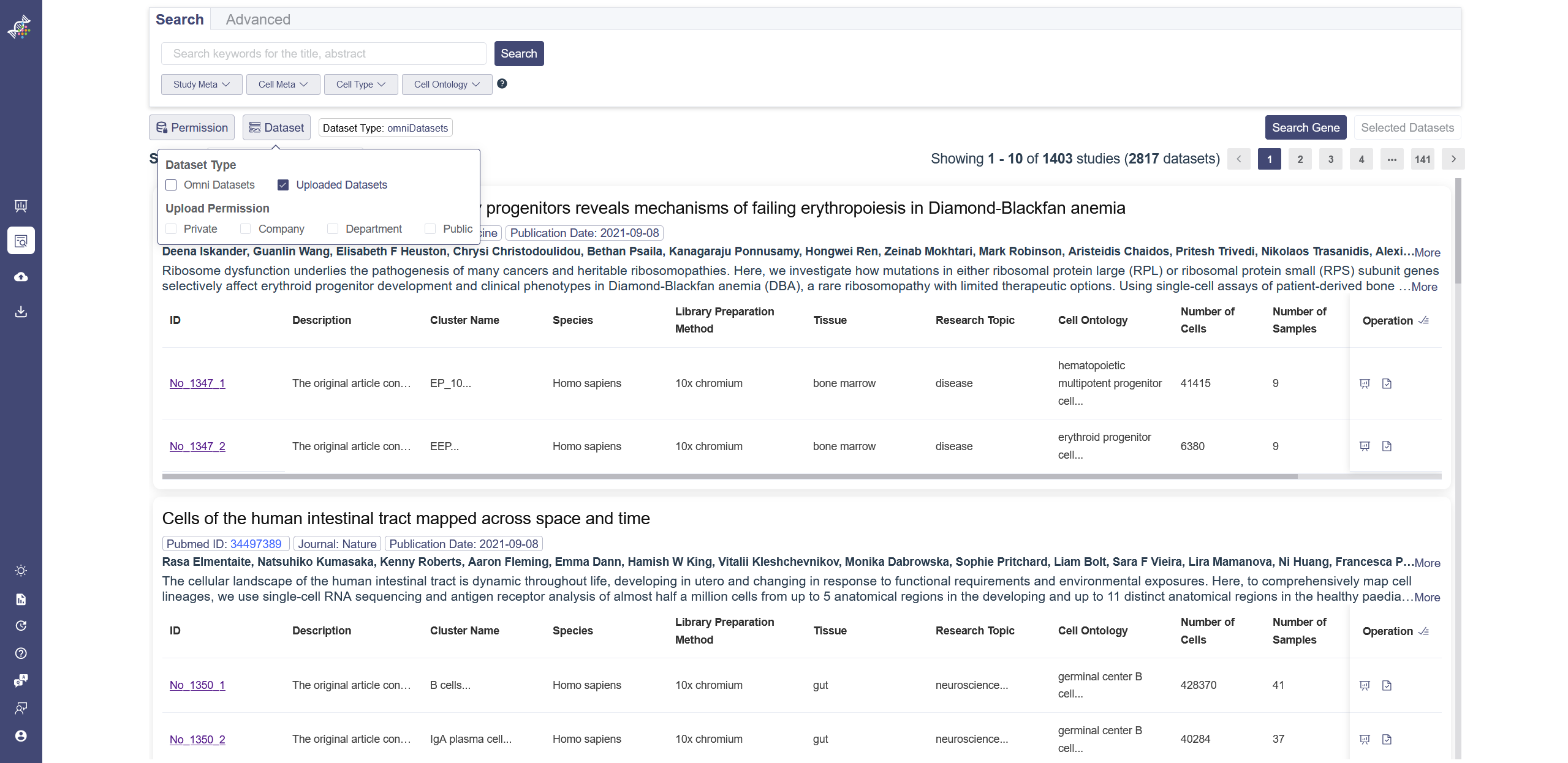
There are two authority control buttons above the dataset list. The Permission button is used to filter the datasets which can be viewed or not, downloaded or not. The dataset button is used to filter the datasets which are uploaded by user or from the Omni Single Cell Database.
# 3.2.4 Dataset List
Datasets are listed according to studies. The overview of the study shows the PubmedID, journal, Publication date, author and abstract. For the datasets, there are also preview of the details of the dataset, like the ID, species, description, research topic and so on. When the dataset ID is clicked on, it will redirect to the single dataset page. In the right end of the dataset is the operation bar, there are three buttons in this area: (1) redirect to the corresponding single-data analysis page; (2) select one dataset at a time; (3) select all datasets belonged to the study; (4) A lock button if this dataset cannot be viewed under the current authority of the account.
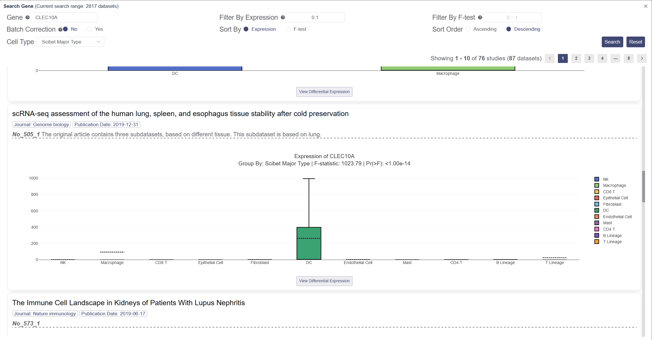
# 3.2.5 Search Gene
Click on Search Gene button on the right side of Search Page and the Search Gene Page will pop up. This function inherits the results from Search Page, if you need to search among all datasets, please click on Clear all button before searching.
Input and then select your target gene in the drop-down list. Search Genes page facilitates to search gene across different datasets. Each entity is supplied with the box plot to show the ln(TPM+1) of the gene expression among all clusters in this dataset. You can filter the result by F-test with the p-value smaller than the input value, or by Expression with the upper quantile expression larger than the input value. Click on Yes to remove the batch effects among datasets presented, so they can be compared at the same level. You can sort the result by expression level or F-test in descending or ascending order. The group by label in the box plot of the Search Gene page can be changed in cell type. Scibet Major Type (human) or Tabula Muris annotation (mouse) by default for datasets without the author’s annotation.
# 4. Explore Single Dataset
OmniBrowser inherits the analysis results from the author. If it is not available, a unified processing flow is applied to generate a complete dataset, and there will be a real-time visual interactive interface to display the dataset. In this processing flow, expression matrices and sample annotations were collected from GEO and GSM. Then after a standard curation process and three quality assurance checkpoints by different specialists, a structured data object was generated. The structured dataset contains matrices, study metadata, cell and gene annotations, tSNE/UMAP coordinates, marker genes, and much more.
The analyses are based on the available cells in the dataset. For most of the functions, the processing time for the analysis or the calculation will take less than half a minute.
# 4.1 Load Dataset
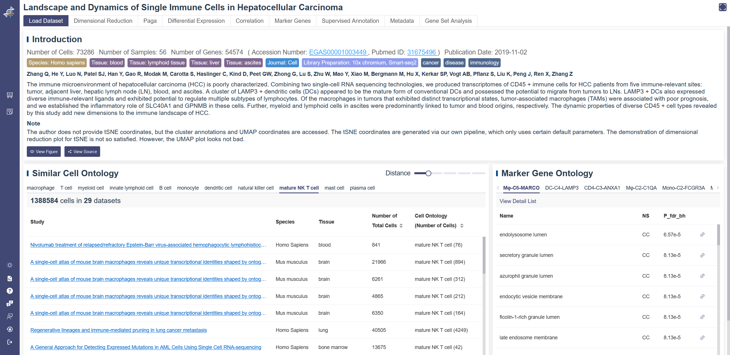
When entering a dataset, the default page is Load Data function. In this function there are three parts here which is introduction, Similar cell ontology and Marker gene ontology.
Information from the publication: in the introduction tab, the number of cells and other tags of a paper are shown, following by author and abstract. Article outline figure can be viewed via the View figure button. View source button will redirect you to the publication. You can also use keyword to search other studies by clicking the title of this publication.
Similar cell ontology: A table of datasets that have the same or similar cell type with this publication is listed. You can visit the listed datasets by clicking on their title. The Distance parameter can be adjusted to show relevant datasets with different ranges, 0 means the same cell type, larger number represents a larger cell ontology distance. Default is 1, which means including cell ontology distance less or equal to 1. Marker gene ontology: The GO information of marker genes for each cluster is listed here, View detail list will lead you to the Gene Set Analysis interface with these marker genes. NS represents Name Space, including three types: molecular function(MF), cellular component(CC) and biological process(BP). P_fdr_bh means false discovery rate (Benjamini–Hochberg procedure), also named Q-value.
A note was added to the Load Dataset page to explain the source of cluster name, t-SNE, UMAP coordinates and whether the dimensional reduction plots are satisfactory. Disease ontology name and disease ontology ID are also added in the note if any. When the research is about cancer, there will be corresponding description.
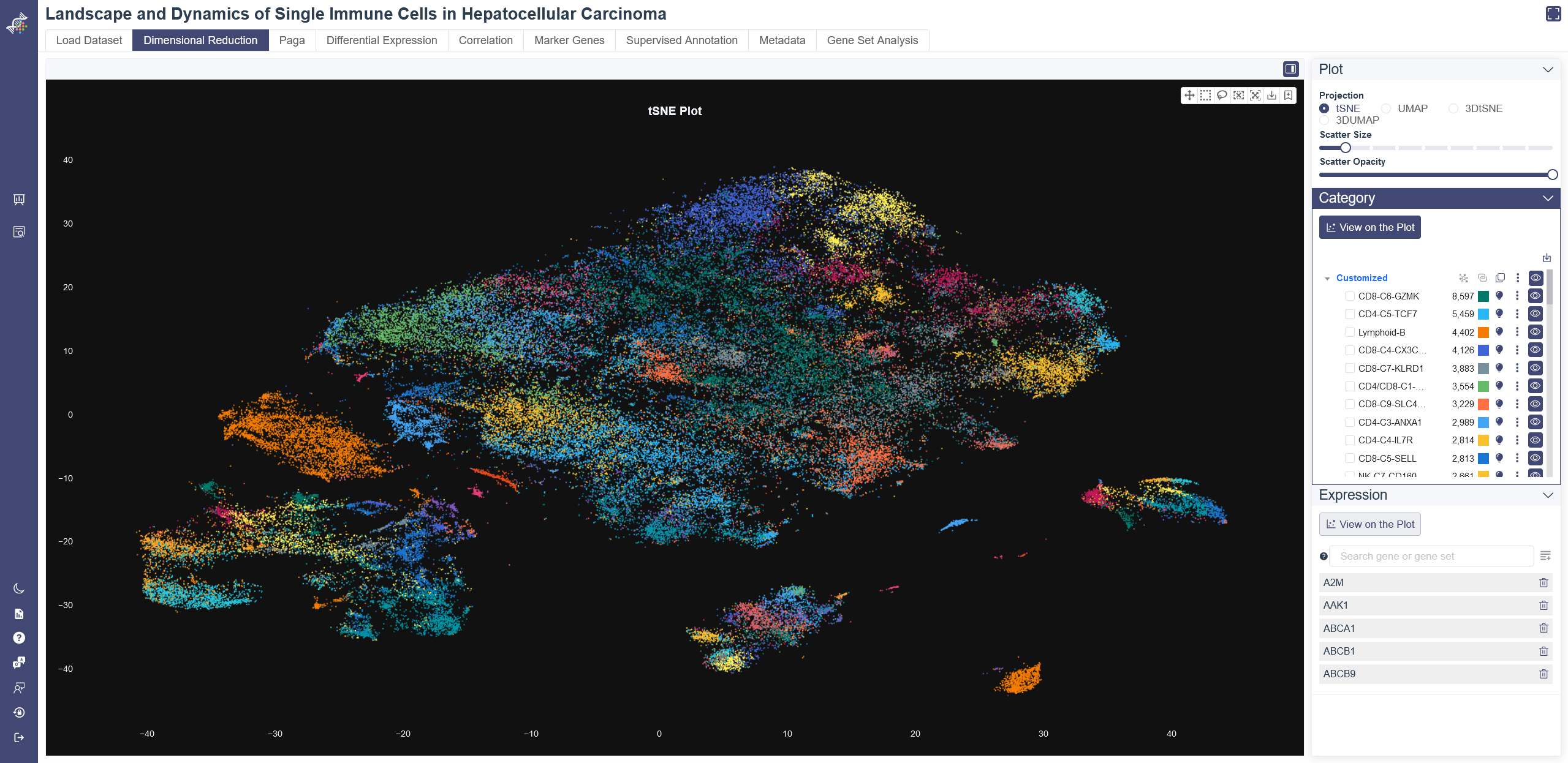
# 4.2 Dimensional Reduction
Dimensional Reduction is a fundamental but powerful function provided by OmniBrwoser. For visualization and further analysis of single-cell RNA sequencing data, PCA was used to reduce dimensions, then t-SNE and UMAP coordinates were calculated. After clustering, OmniBrowser offers interactive 2D and 3D views of t-SNE and UMAP results. Various parameters are available to adjust the visualization of the dimensional reduction plot.
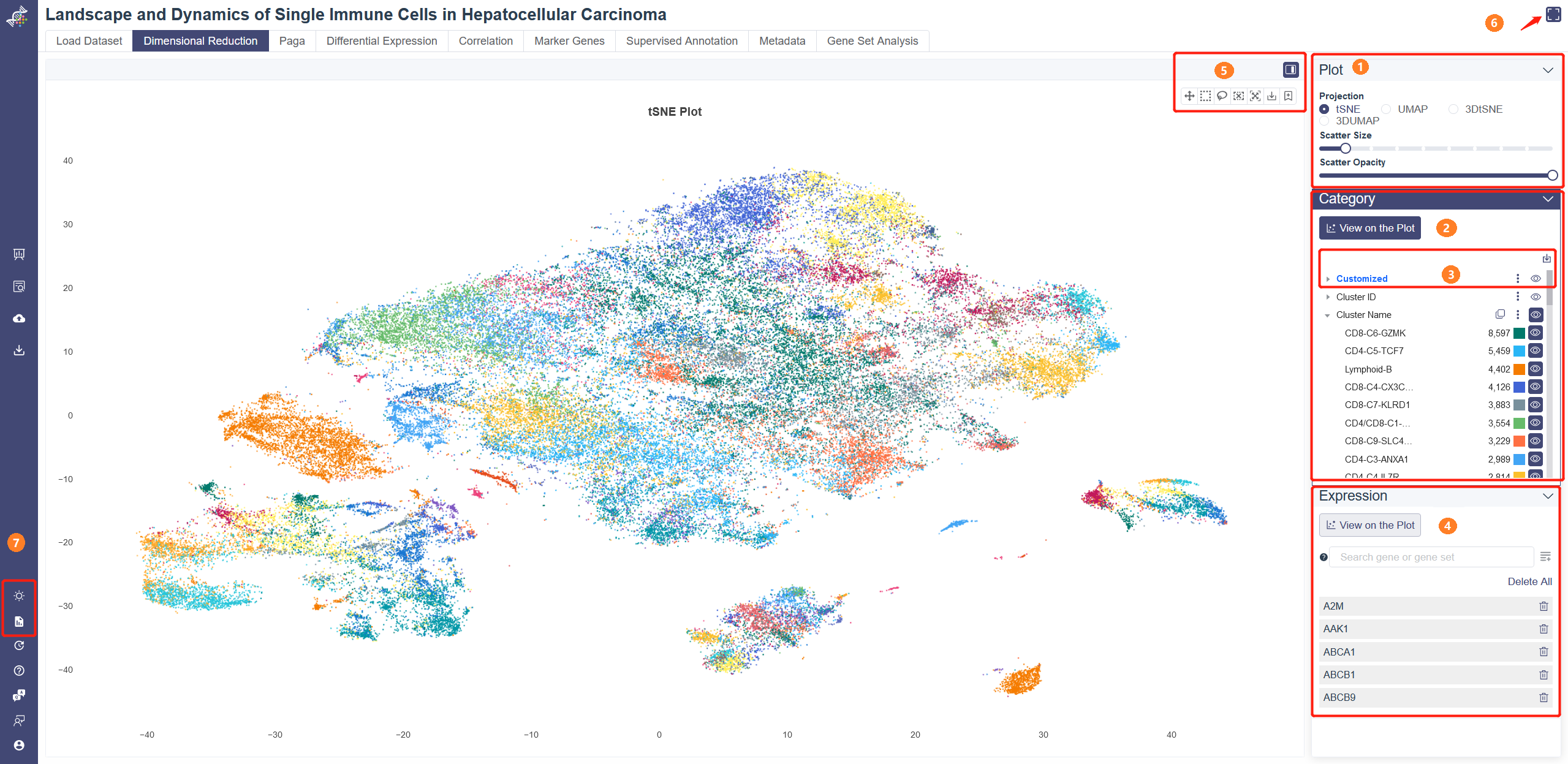
# 4.2.1 Plot Module
Projection: You can visualize the dimensional reduction results in 2D or 3D view on Dimensional Reduction page. Methods can be toggled between t-SNE and UMAP on the right-side tab. You can scroll Mouse Wheel to zoom in/out or press and hold the Right Mouse button to rotate. Scatter Size: adjust the sliding panel to set the pixel of the plot. Scatter Opacity:adjust the sliding panel to set the opacity of the plot.
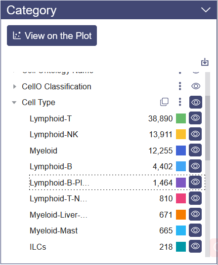
# 4.2.2 Category
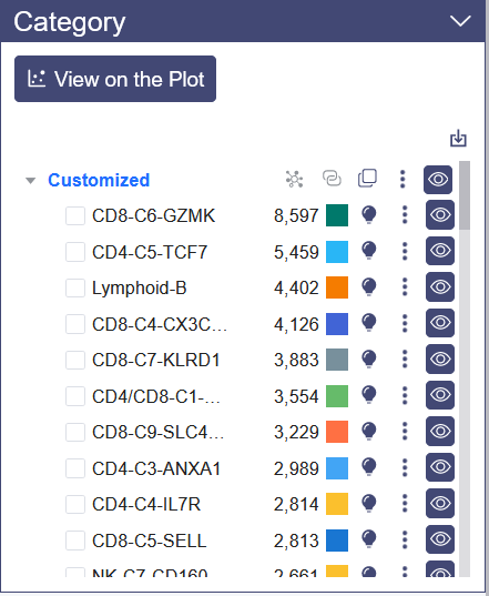
Category View: Category View will show up by default on Dimensional Reduction page. Plot can be colored by different groups of annotation labels, e.g. Cluster Name, Cell ontology name.
Clicking the triangle symbol on the left end to view the detail of the annotation label. In the right side of the annotation label, there are clone button to replicate the annotation, save as image button, add to report button and view button. When clicking the cell group name beneath the annotation label name, the selected cell group will be highlighted on the dimensional reduction plot, and a dashed box on the cell group name.
Click the color bar of the interested group in the Color By legend, and the selected group of cells will be highlighted in the chart. Unclick the bar can remove the highlight. Also, the color of each group is auto-generated to ensure that the color contrast of adjacent points in the chart is big enough for a good presentation.
# 4.2.3 Custermized Annotation
There is import button on the upper right of the category panel, which support to import json format customized annotation file, and the example file can be view when the mouse pointer on it.
After clicking the clone button, there will be a pop up menu to input the cell group’s name. The replicated cell group name is blue; Besides the clone function there are various button here:
1 recluster: select at least one cell group, clicking the Recluster Selected button, and there are two arguments should be set:
a) Resolution: the higher value of the resolution, the larger reclustered cell group count;
b) Cutoff: used for setting the low limit of cell group count value, default value is 0.5%, if the cell group count after re-cluster is smaller than the cutoff value, this cell group will return to the original cell group.

2 merge: select at least two cell groups. Click merge button and input new cell group name to merge the two cell groups.

3 other function: click the drop-down menu button, there are functions to manipulate the selected cell group.

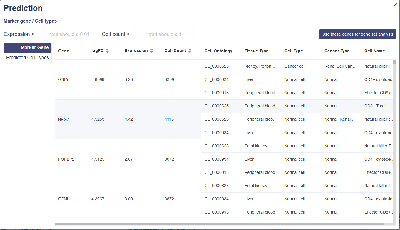
4 Prediction:
The predict function is developed for users to customize cell groups in the 2D or 3D embeddings (tSNE or UMAP). Then the marker gene list and the potential cell type inferred by the enrichment analysis will be returned based on the CellMarker database. For cell types in the CellMarker database, we can find the top entries that are significantly enriched in the given marker list compared to all genes in human or mouse genome, under the null hypothesis that the genes of the given marker list were randomly sampled from the genome (no enrichment found). The less the p-value is, the more likely the cell type will be the predicted one.
In embedding view, select a cell cluster by clicking on the icon on the right side of the legend. The pop-up window includes the Marker gene tab and Predicted Cell types tab. Marker Gee tab shows the Marker Gene table of selected cell cluster. The logFC represents log2(fold change). Users can filter these genes by Expression and Cell count, and then Use these genes for gene set analysis will lead you to the Gene Set Analysis page and do an analysis with these genes. You can also switch to the Predicted Cell Types table, which shows possible cell type prediction.
5 Edit: Edit the cell cluster name;
6 Delete:After clicking the delete button, all the deleted cell clusters color will be turn to grey and names will be changed to “undefined” automatically, the cell clusters will undetectable on the plot as well as the subsequently analysis.

# 4.2.4 Top-right Tool Bar

Hide sider: Click on the Hide sider button to hide the parameter modules to view the plot.
Pan: Click on Pan button to move the whole plot.
Selection (select-recluster): select a bunch of cells with box select or lasso select, then a menu will pop up. Click on Cancel to go back to the plot.
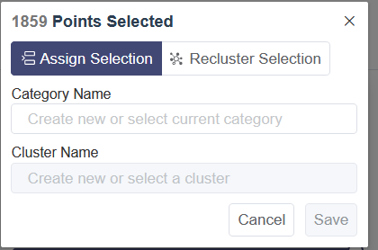
Assign Selection: Assign the selected cells to a cluster of one group of customized annotation. Select the customized group from the drop-down list of Category Name and then select the cluster name.
Recluster Selection: Click on Recluster Selection to re-cluster the selected cells. This function is same as the “Recluster” function above.
Reset Scale: Click on Reset Scale to go back to the default visualization of the plot.
Save as image: Export the current visualization of the canvas as a png file.
Add to report button is in the upper right corner of each downloadable image. Click the button to add the image to the report.
Matrix view of expression
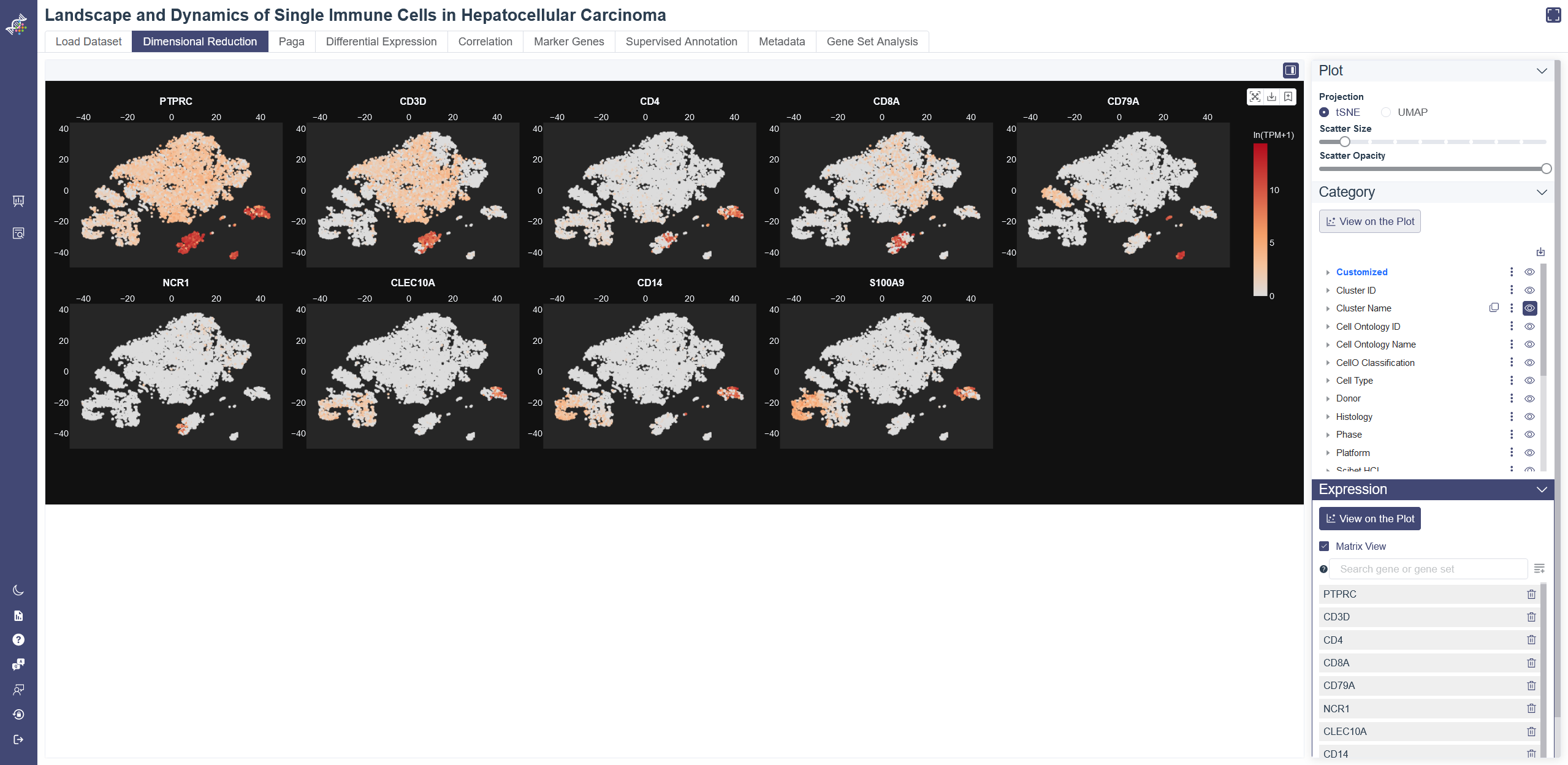
# 4.2.5 Expression
The gene expression level can color the embedding result. Use this function with marker genes would help distinguish the cell type of each cluster.
Click on the View on the Plot button in the Expression Module, the average expression of the five default genes shown below the input box will show up in the plot. The default genes can be deleted by clicking on the button on the right side of the gene or Delete all button. Input and select one or several genes then click on Add to List button, embedding plots with each gene expression level will show up in Matrix View when selected.
The gene expression level can also color 3D embedding plots. Click on 3D view, Input and select one or several genes then click on Add to List button, then the 3D embedding plot will be colored by the average expression level of your inputted gene(s).
# 4.2.6 Full Screen
Full screen function is added on the upper right corner, it enlarges the visualization canvas and hide the function switching panel for a better presentation.
# 4.2.7 Left-side Tool Bar
Plot Theme: Click on Plot Theme icon to change the background color of the website. The background color is white by default and can be switched to black.
Save Report: Click on Save Report icon to download all the images added to report in batch.
# 4.3 Paga
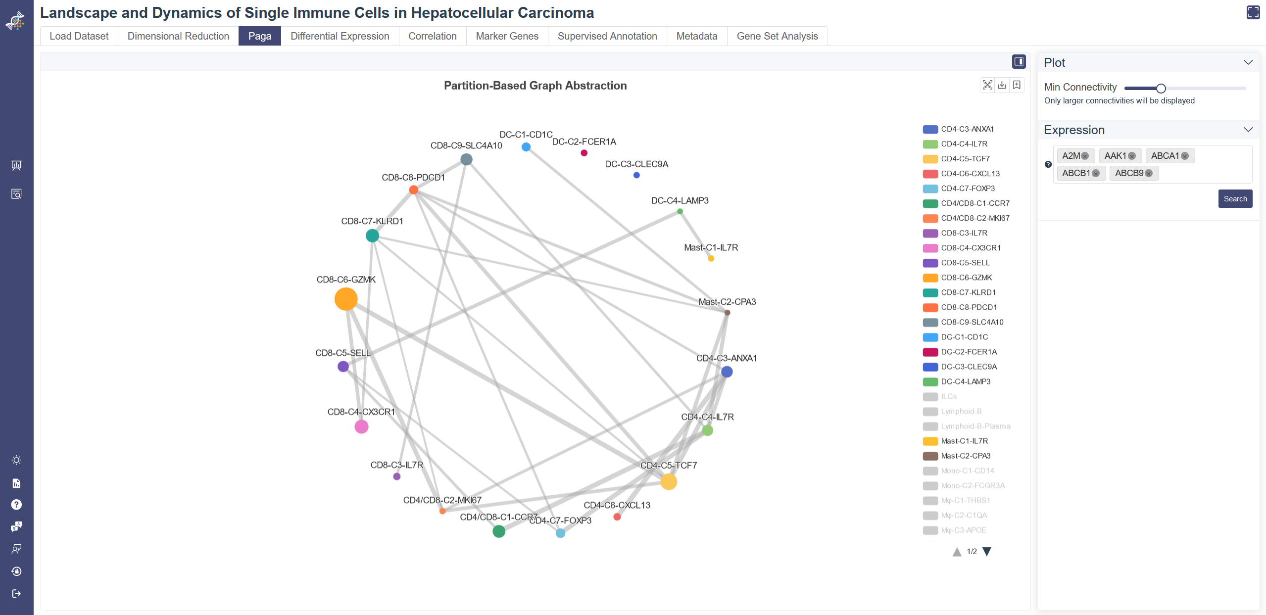
Choose the PAGA tab to show the PAGA plot. PAGA graph in PAGA tab shows the connectivity between clusters, and each node represents a cell group, differentiated by their color, with node size indicating the number of cells, the width of edges reflecting connectivity between groups.
Filter groups: groups can be filtered via the legend on the right.
Min connectivity threshold: connectivity threshold can be adjusted to show a different level of connectivity.
Expression:Cell cluster node on the paga plot can be colored by the gene expression.
PAGA plot can also be colored by gene expression level via the Search button.
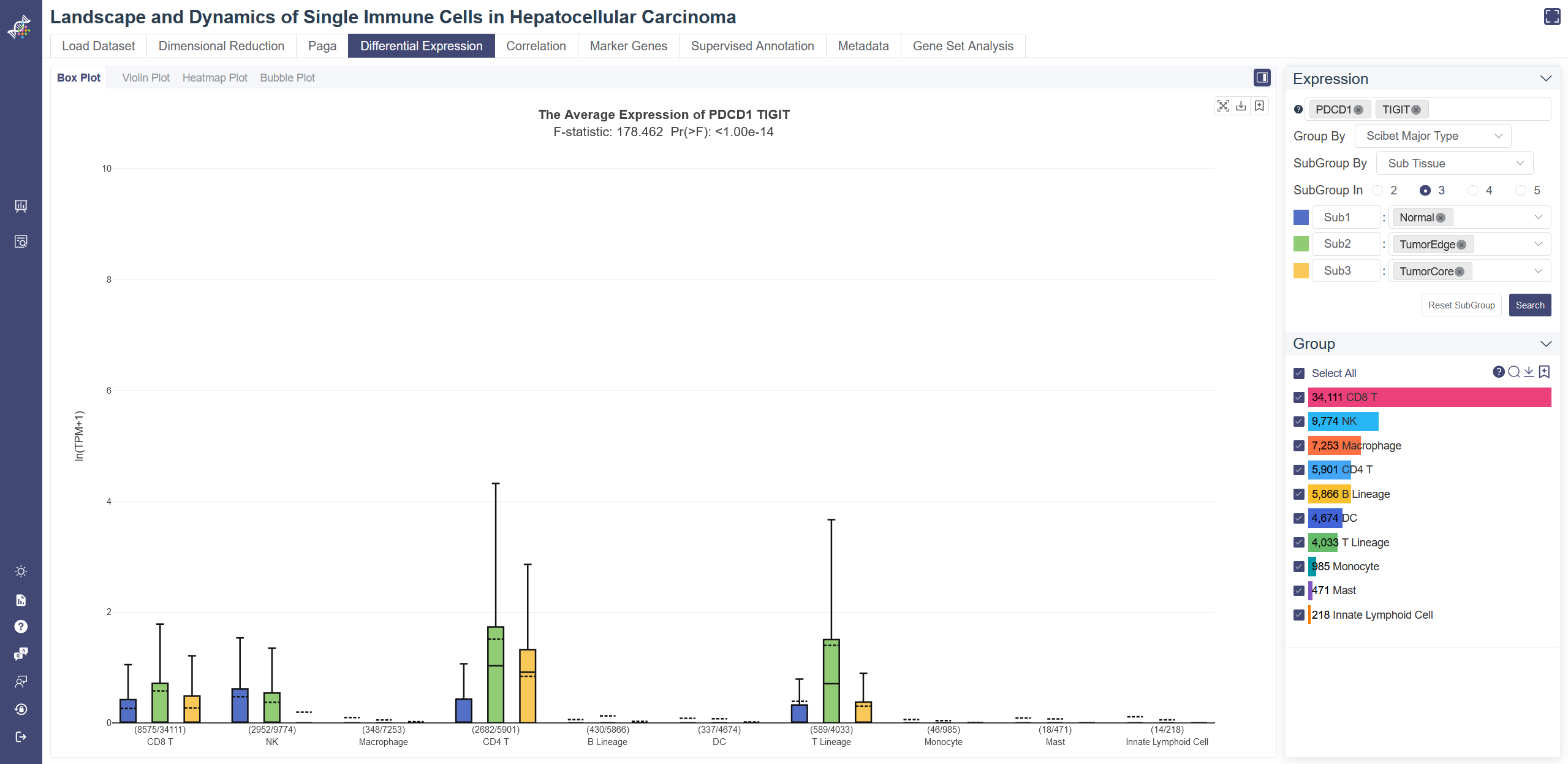
# 4.4 Differential Expression
Differential Expression page facilitates to explore the gene expression difference between cell groups and subgroups. Box plot, violin plot, heatmap and bubble plot visualizations are available on this page.
# 4.4.1 Box Plot
Box plot reflects the differential expression of the gene or gene set across different cell groups. F-test is used for each gene or gene set to identify whether it is differentially expressed across all cell groups simultaneously, under the null hypothesis that the gene or gene set does not differentially express among all cell groups. The less the p-value is, the more likely the gene or gene set was differentially expressed. To determine whether the gene or gene set expression level of a group is different from the rest groups, OmniBrowser executes a t-test between a selected group of cells (experiment group) against the other cells (control group). The less the p-value is, the more likely the gene or gene set will be differentially expressed in this group.
Click on Differential Expression and in Box Plot tab shows the box plot.
Generate box plot: Input and select the target gene or gene set, then click on Search, you may also change Group By or SubGroup By properties to adjust the box plot.
Groups can also be filtered from the legend on the Groups tab.
F-test is conducted on the fly by default to evaluate statistical significance. The overall F and p values can be found on the top of a box plot.
T-test result of each group compared with the rest shows up when you put the mouse over a group's name of the legend on the right.
For datasets with a large number of groups, the full plot is too dense to show each group clearly. Now we have added a slider at the bottom to zoom in a selected range of the plot.
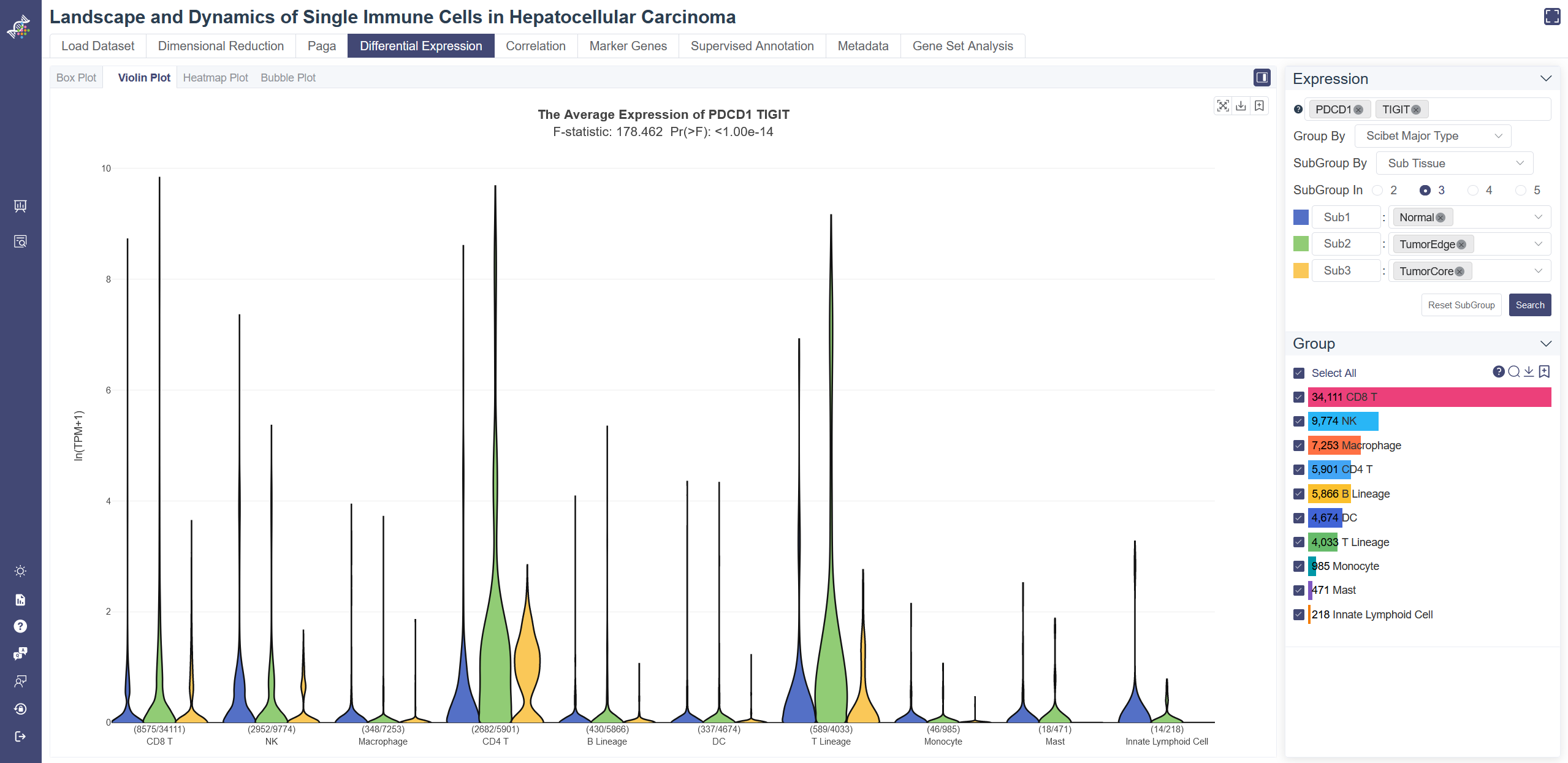
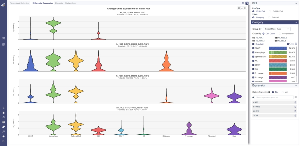
# 4.4.2 Violin Plot
Violin plot reflects the expression distribution of the gene or gene set across different cell groups. F-test is used for each gene or gene set to identify whether it differentially expresses across all cell groups simultaneously, under the null hypothesis that the gene does not differentially express among all cell groups. The less the p-value is, the more likely the gene was differentially expressed. To determine whether the gene or gene set expression level of a group is different from the rest groups, OmniBrowser executes a t-test between a selected group of cells (experiment group) against the other cells (control group). The less the p-value is, the more likely the gene or gene set will be differentially expressed in this group.
Click on Differential Expression and in Violin Plot tab shows the violin plot.
Generate violin plot: Input and select the target gene or gene set then click on Search, you may also change Group By properties to adjust the violin plot. Groups can also be filtered from the legend on the Groups tab.
F-test is conducted on the fly by default to evaluate statistical significance. The overall F and p values can be found on the top of a violin plot. T-test result of each group compared with the rest shows up when you put the mouse over a group's name of the legend on the right.
Subgroup function: Subgroup function highlights the differential expression among subgroups. Group By can select the first-layer grouping. the second-layer grouping can be selected with the SubGroup By button and the number of subgroups you need can be determined in SubGroup In item. Finally, subgroups can be defined in the pop-up list.
# 4.4.3 Heatmap
Gene-cluster heatmap displays gene expression patterns across clusters. Each unit of the matrix represents the average gene expression within the cell group.
Click on Differential Expression and in Heatmap tab shows the Heatmap.
Generate heatmap: Input and select the target gene or gene set then click on Search, you may also change Show Type from all Clusters to All Cells to adjust the heatmap. Groups can be altered from the drop-down list in the Group By parameter.
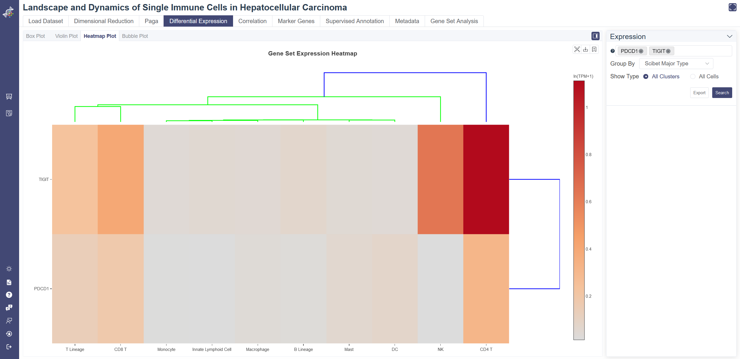
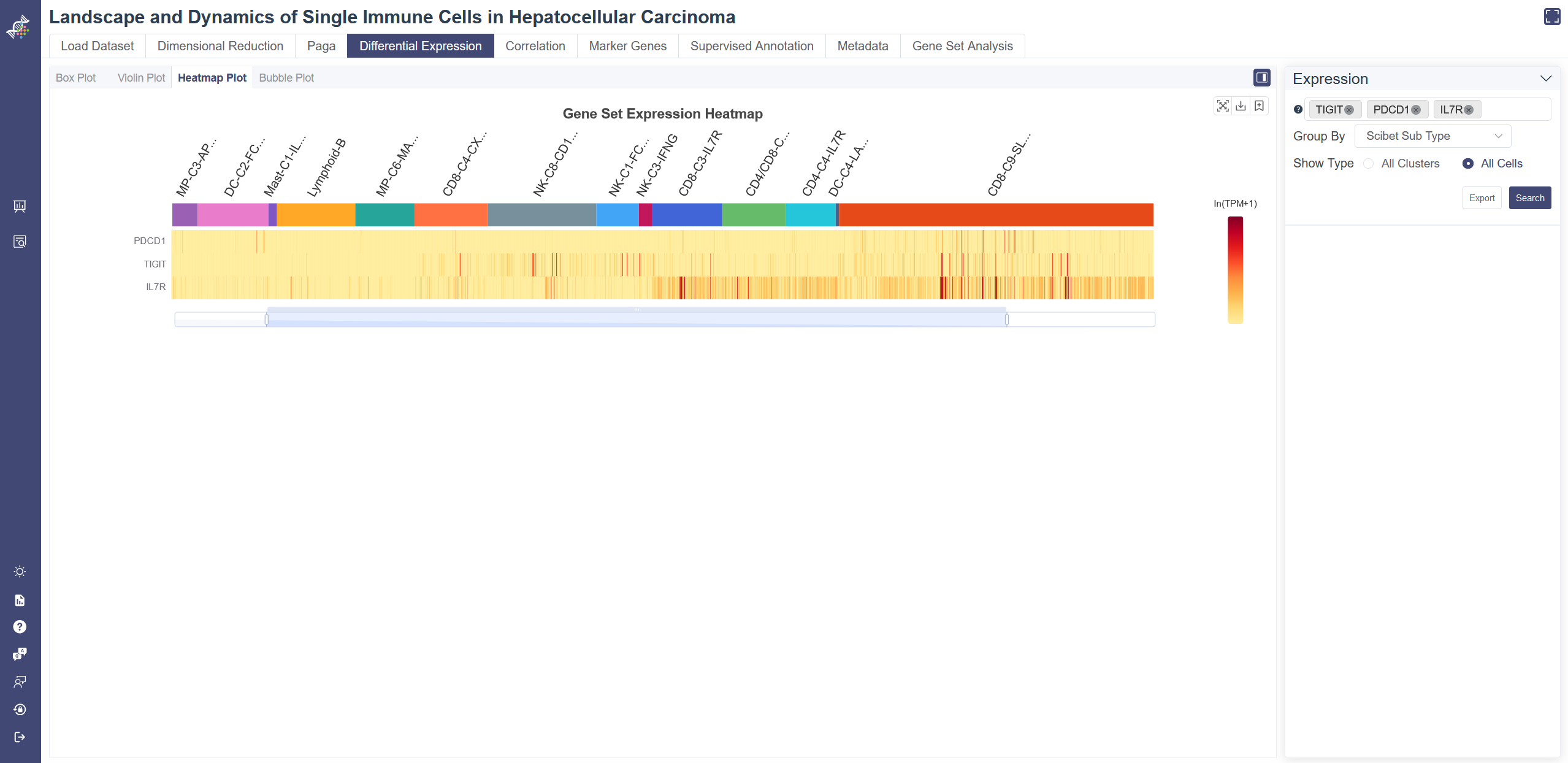
Dendrogram: the dendrogram on the heatmap shows the similarity between groups and between genes. The shorter the link that connects two elements represents the more similarity.
Data used to generate the heatmap can be exported via Export button.
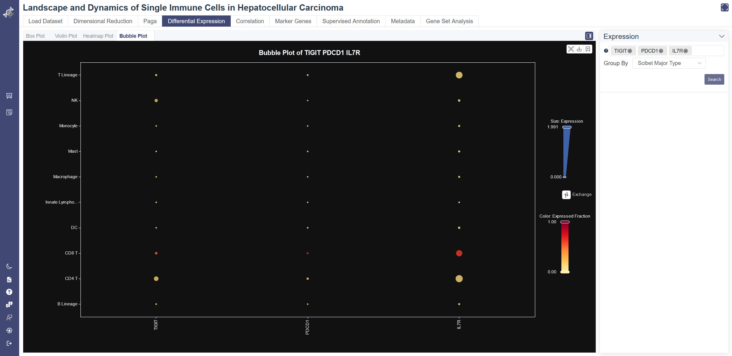
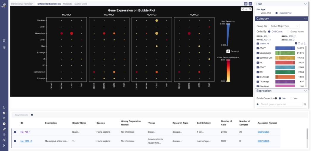
# 4.4.4 Bubble Plot
Box plot reflects the differential expression and the expressed fraction of every single gene across different cell groups.
Click on Differential Expression and in Bubble Plot tab shows the Bubble Plot.
Generate Bubble Plot: Input and select the target gene or gene set then click on Search, you may also exchange the visualization of expression and expressed fraction to adjust the bubble plot.
Groups can be altered from the drop-down list in the Group By parameter.
# 4.5 Correlation
The correlation page offers pairwise correlations scatter plot, pairwise correlations heatmap, gene-wise similarity graph and similar genes query tool to explore the relationship between genes and group of genes.
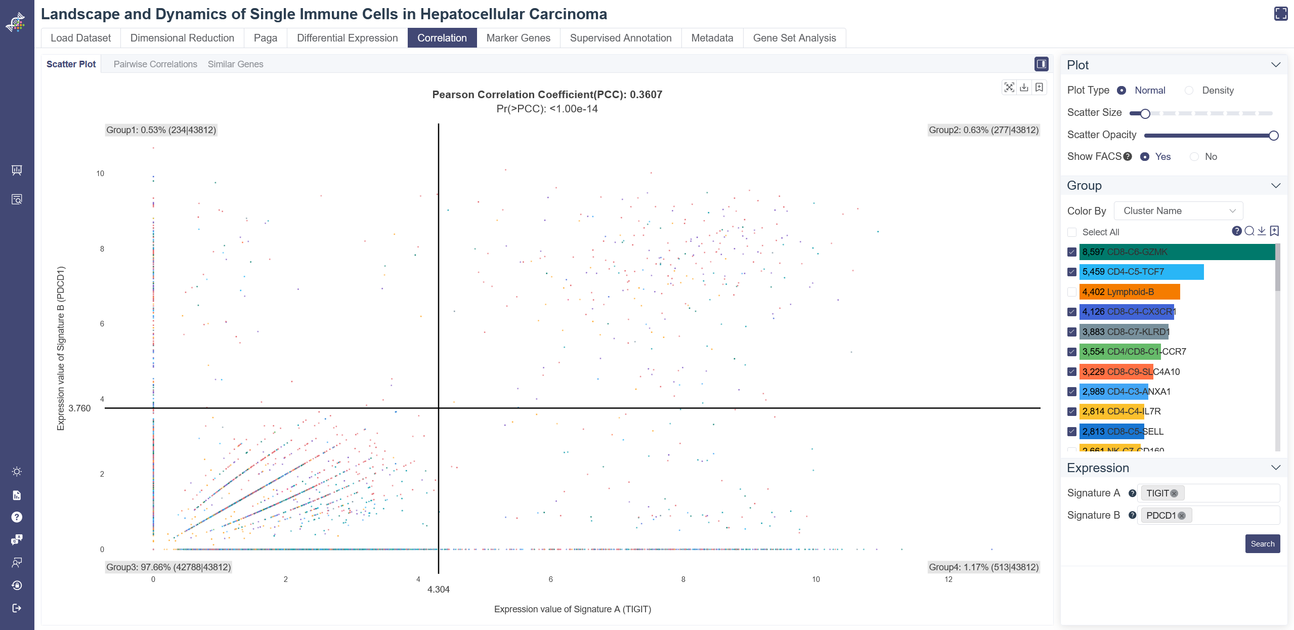
# 4.5.1 Scatter plot
The correlation scatters plot is used to visualize the association between genes or gene sets. The Pearson correlation coefficient and p values can be found on the title of the plot.The p-value was calculated under the null hypothesis that the expression of such gene set signatures are drawn from independent normal distributions. The less the p-value is, the stronger the correlation is.
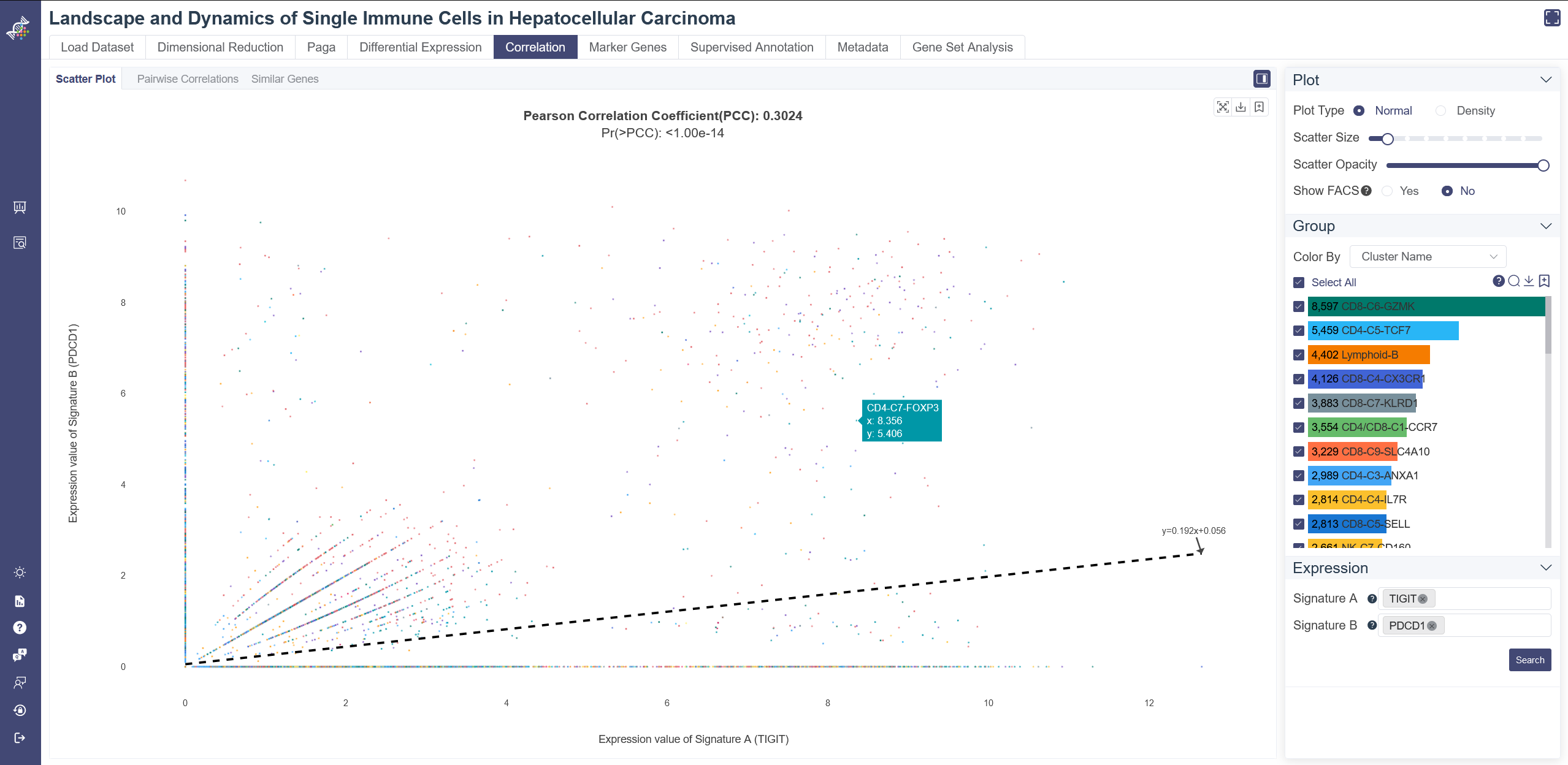
Click on the Correlation page and in Scatter Plot tab shows the pairwise correlation scatter plot.
Generate scatter plot: Input and select the target gene(s) for Signature A and Signature B, choose Normal as Plot Type, then click on Search. Groups can also be filtered from the legend on the right.
Show FACS: Click on Yes to Show FACS by adding reference lines in this plot, you can drag the lines to explore accurate cell number or proportion of the divided four regions. Click on No will add a linear regression curve and equation in this plot.
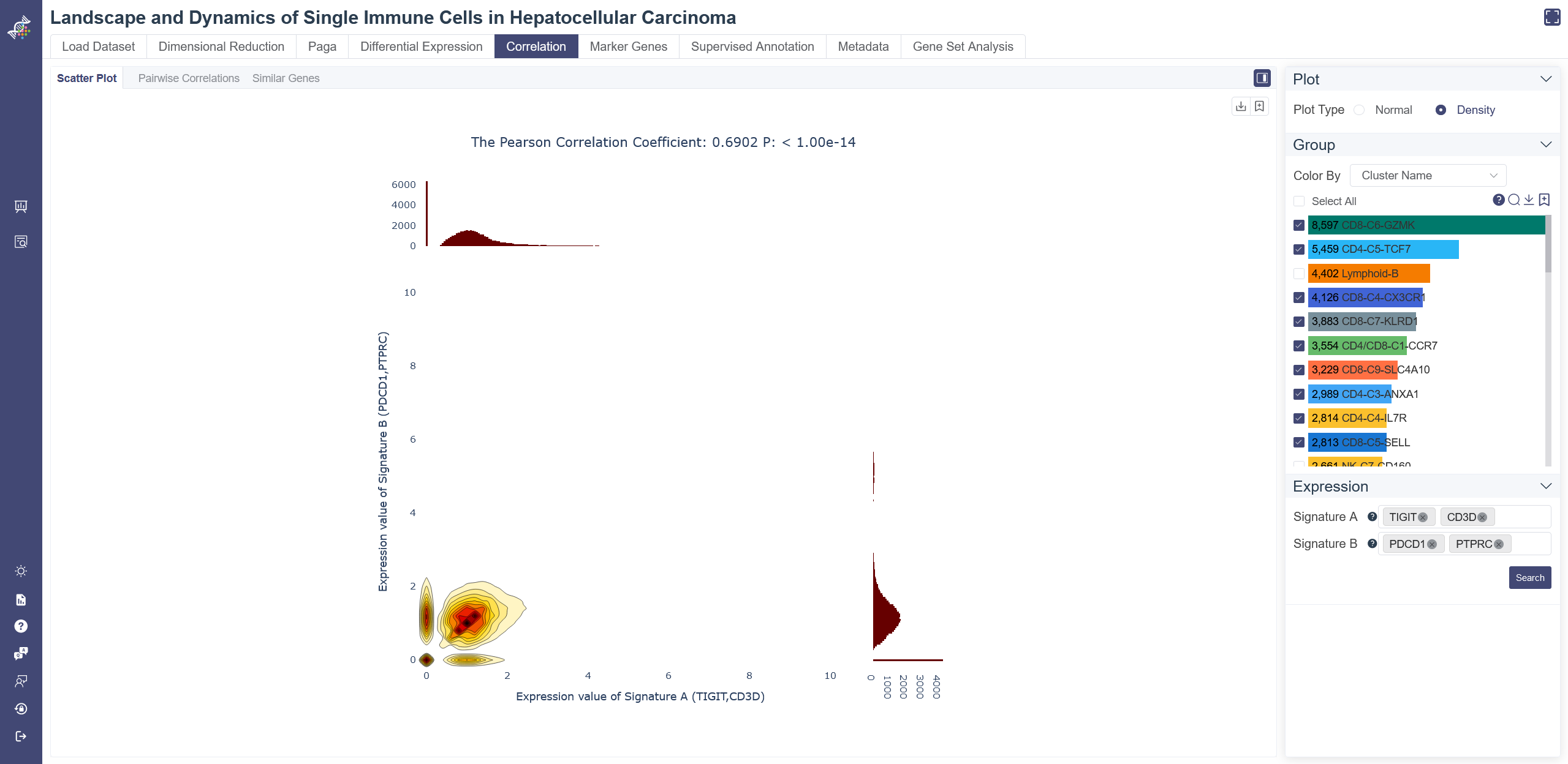
The density plot displays four subplots within one graph. Besides the original scatter plot, the two histograms represent the expression distribution of signature A and signature B separately, while the contour graph shows the density distribution of the two signatures.
Switch to density scatter plot: normal scatter plot can be toggled to density plot by Density button.
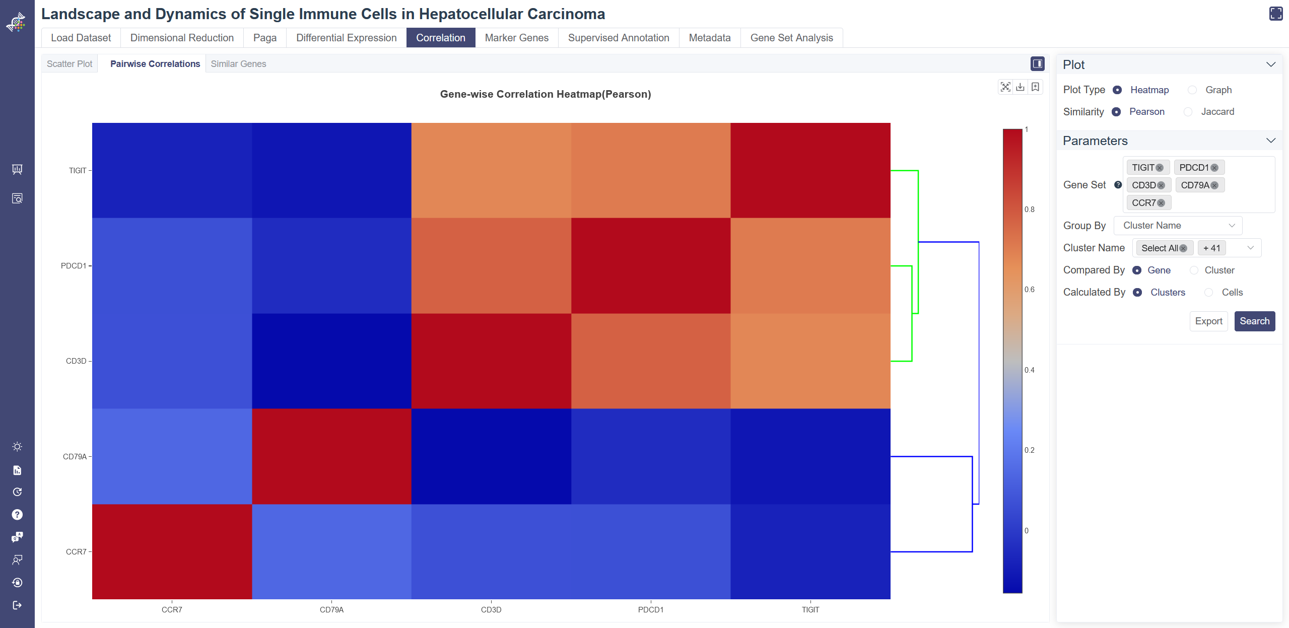
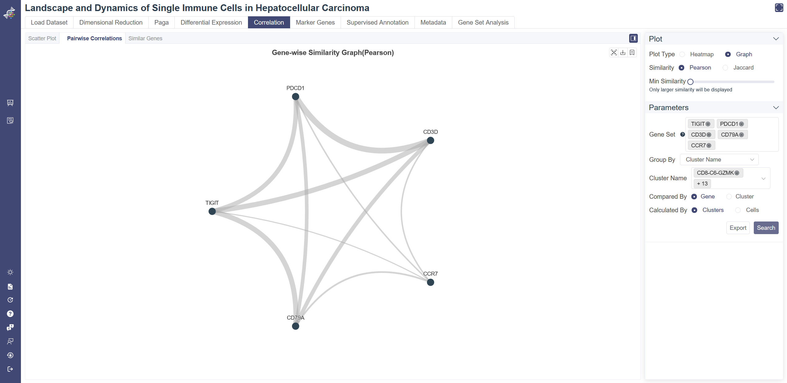
# 4.5.2 Pairwise Correlations
The correlation heatmap is used to display gene similarity and cluster similarity.
Click on the Correlation page and in Pairwise Correlation tab shows the pairwise correlation heatmap. Switch the plot type by clicking on Heatmap or Graph. You can visualize the similarity by Pearson correlation coefficient or Jaccard Index.
Gene-wise Similarity Graph: Click on Graph to show the similarity between genes or clusters. Each node represents for a gene or a cell group, and the width of edges reflecting the similarity between groups.
Change and filter groups: groups can be altered and filtered via the drop-down list on the right. Min connectivity: connectivity threshold can be adjusted to show a different level of connectivity.
Dendrogram: the dendrogram on the heatmap shows the similarity between groups or between genes. The shorter the link that connects two elements represents the more similarity.
Pairwise Correlation Heatmap: You can input the gene set and select the group in the drop-down list of Group By and then clusters you want to include, then toggle the comparison unit between cluster and gene from Compared by parameter. If Compared by Gene is chosen, then you may further define the Calculated By parameter.
Data used to generate the heatmap can be exported via Export button.
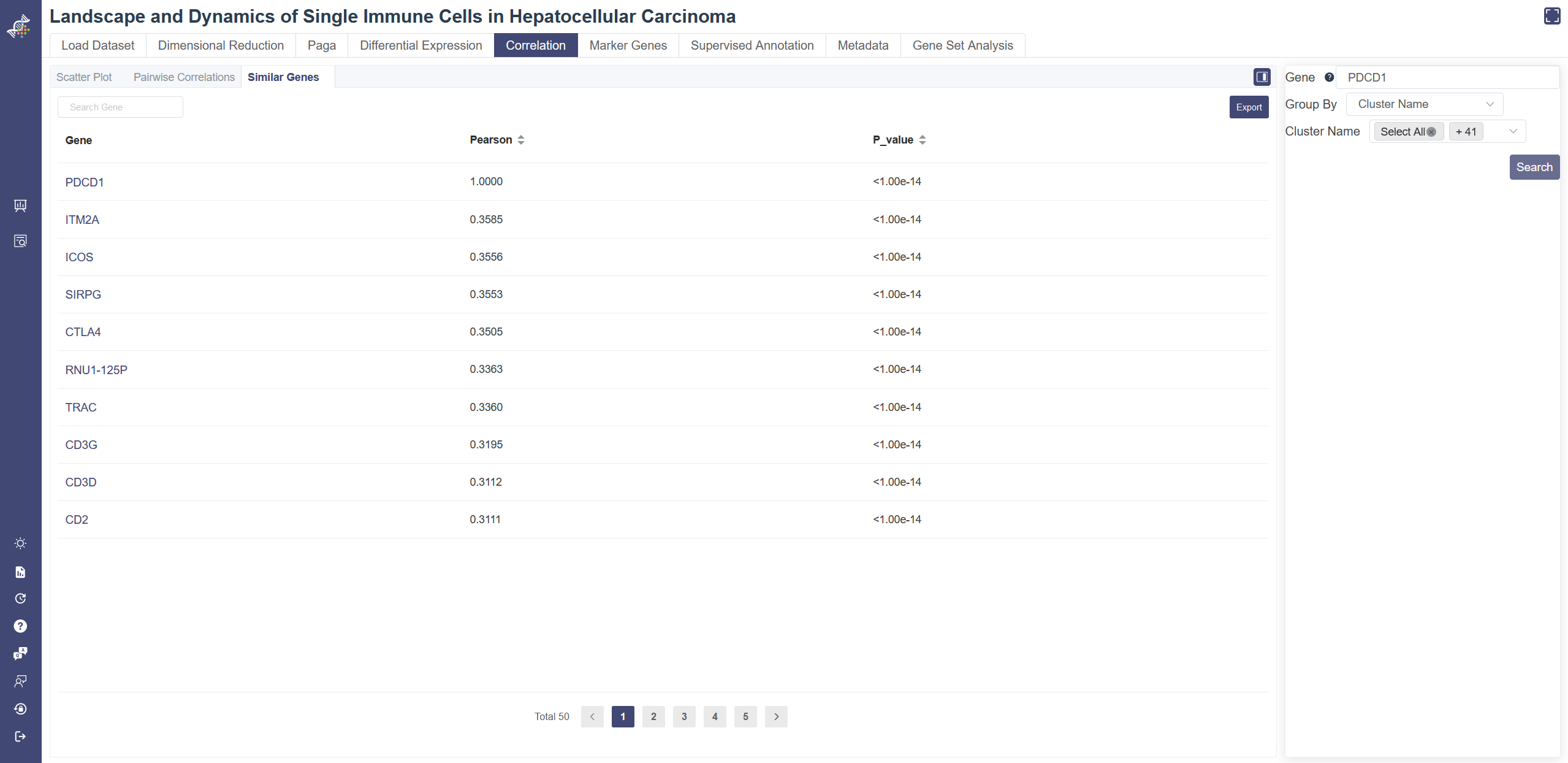
# 4.5.3 Similar genes
Similar Genes tool queries all the similar genes of the selected gene. Pearson correlation coefficient is calculated between the user-input gene and each of the other genes, in order to find the most correlated genes. The p-value was calculated under the null hypothesis that the expression of such gene set is drawn from independent normal distributions. The less the p-value is, the stronger the correlation is.
Click on the Correlation page and in the Similar Genes tab, you can input and select your target gene.
You may also choose different groups and include clusters you want, then click on Search to view the result table. The result can be sorted by Pearson coefficient or p-value. Ligand and receptor info are also listed if any. Data in the table can be exported via Export button.
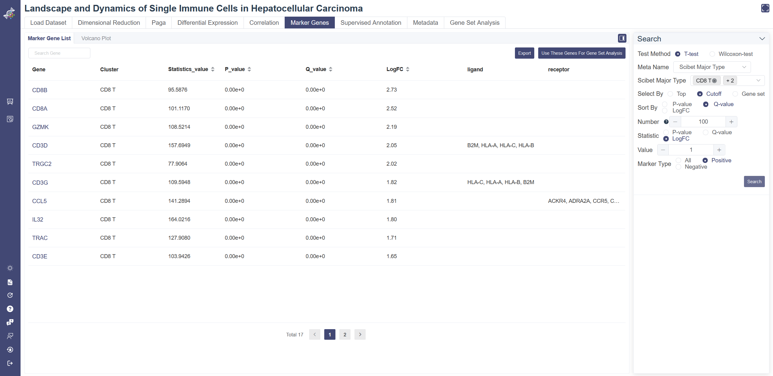
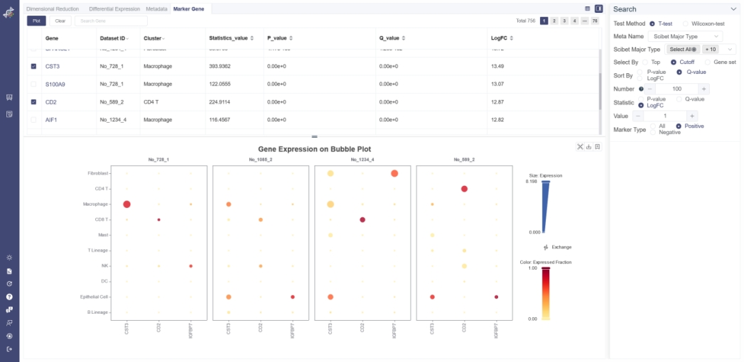
# 4.6 Marker Genes
The Marker gene page shows marker gene information of a cluster, also allows users to verify the identity of certain clusters and help identify any unknown clusters. To determine each gene is a marker gene or not, a t-test or Wilcoxon-test is used to identify whether a gene differentially expresses between a selected group of cells (experiment group) against the other cells (control group). The less the p-value is, the more likely the gene will be a marker gene.
Click on the Marker Gene page shows the marker gene list query function.
# 4.6.1 Search Marker Gene
Select a meta group in Meta Name and cluster(s) of interest. To filter positive or negative marker genes, please choose Statistic to be LogFC first and then select by Marker Type. Click on Search shows the marker gene table of the selected cluster(s). LogFC represents the log of fold change.
The table can be exported to excel files via the Export button. You can click on Use these genes for gene set analysis button to carry out gene set analysis.
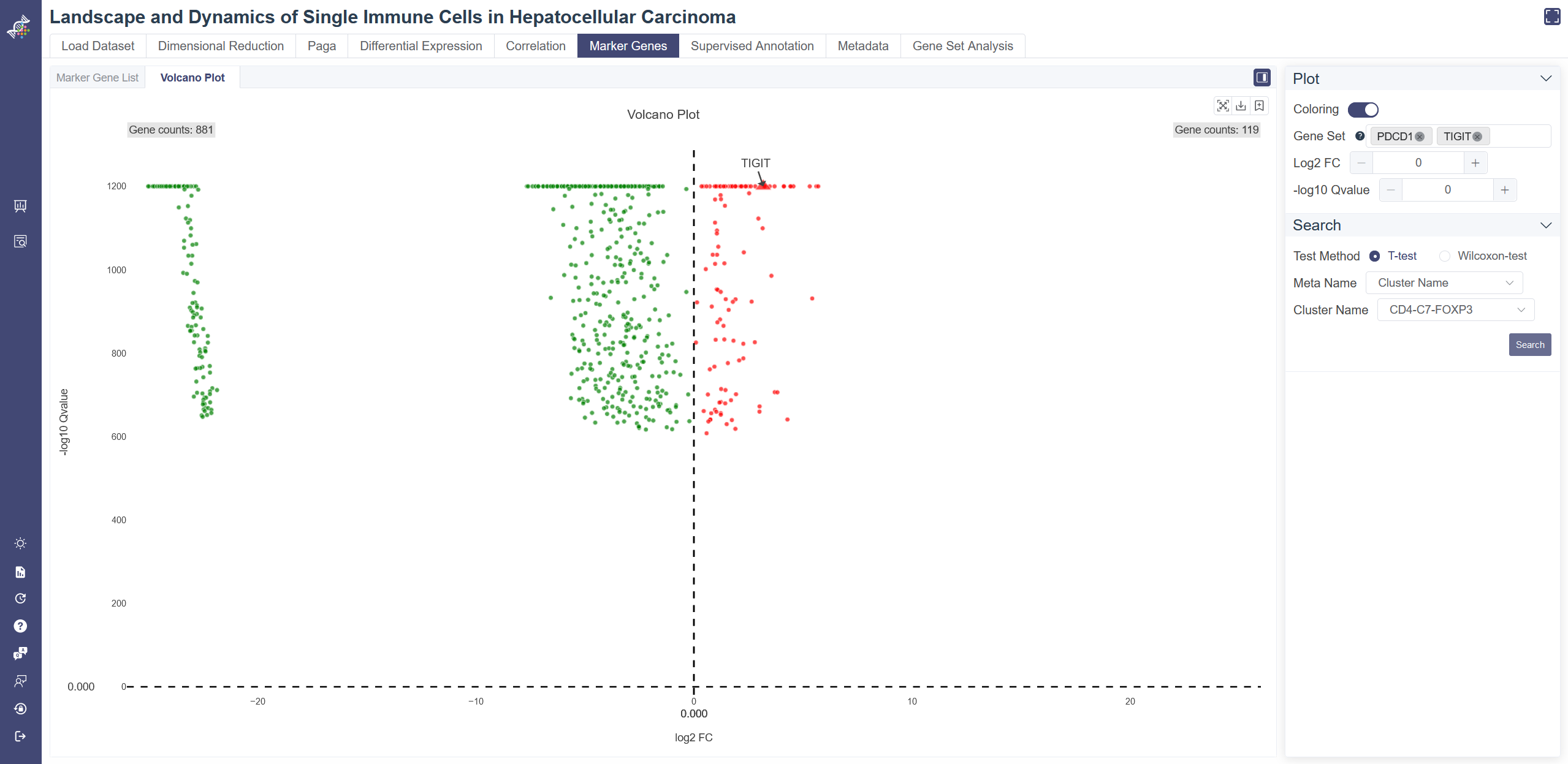
# 4.6.2 Volcano Plot
Click on the Marker Gene page and in Volcano Plot tab shows the volcano plot. Choose test method, meta group by Meta Name and cluster to visualize. Positive marker genes are colored red and negative marker genes are colored green. Turn off the coloring by switching Coloring. Input genes in Gene Set box to display the gene name on volcano plot. Set the horizontal cutoff line by -log10 Qvalue and the vertical cutoff line by log2FC.
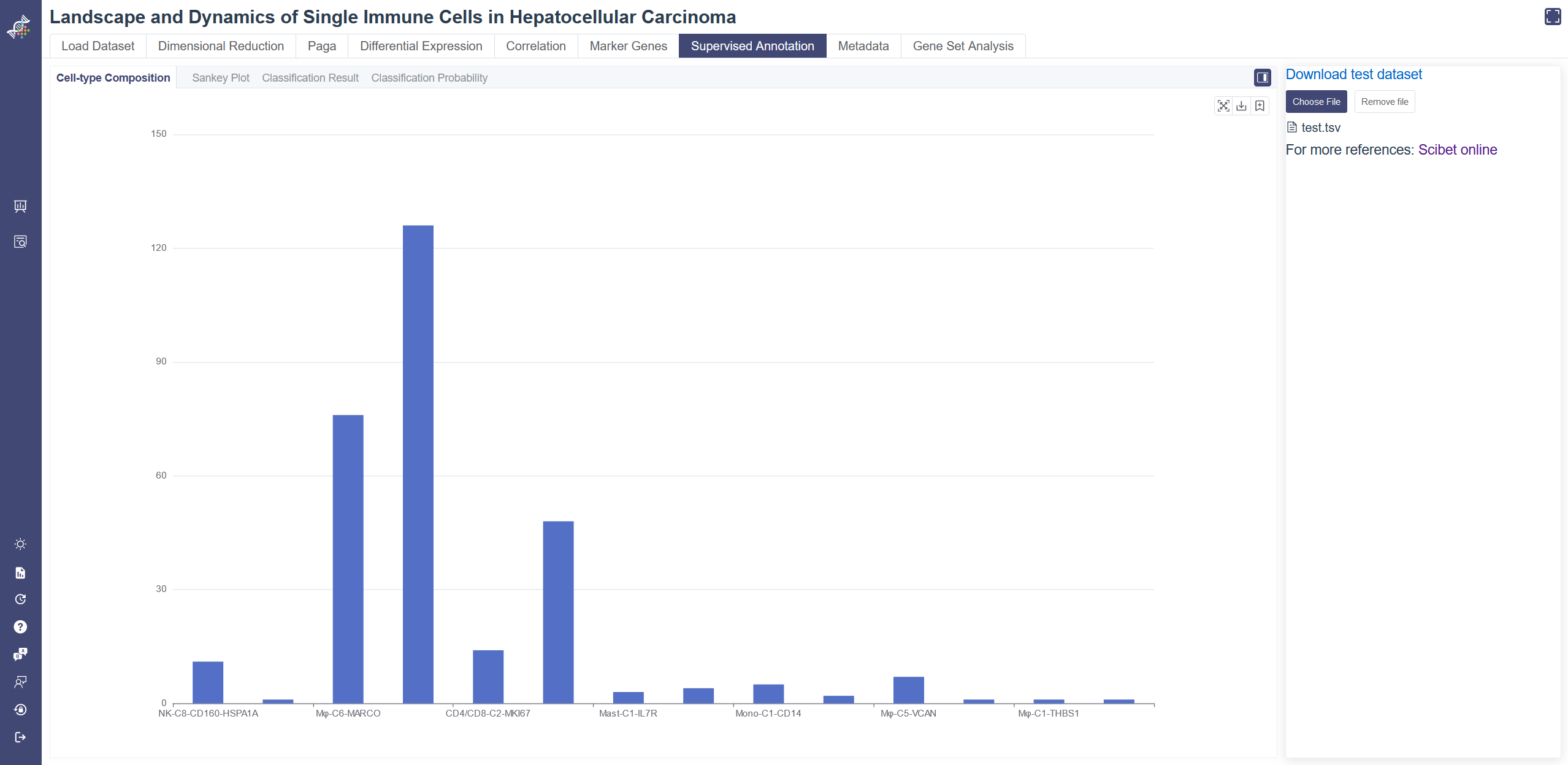
# 4.7 Supervised Annotation
Supervised annotations utilize the scibet algorithm and the public dataset to annotate your dataset. For each dataset, a reference kernel was trained by the SciBet method, so that this dataset could be used as a reference to perform cell type annotation on uploaded scRNA-seq data. Before you run this function, please choose a dataset most similar to your data in cell type. You may view the dataset profile on the Load Dataset page of each dataset.
# 4.7.1 Cell-type Composition
Cell-type Composition tab shows all the predicted cell types distribution of your uploaded cells. On the Supervised Annotation page, click on Choose File to upload your tsv file then you can see the predicted annotation results of your data. A sample dataset is available via the Download test dataset button. You may refer to its format and attributes.
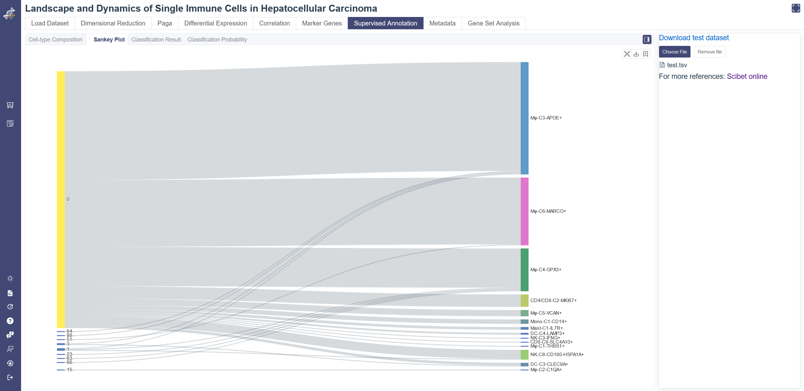
# 4.7.2 Sankey Plot
Click on the Sankey Plot tab shows the Sankey plot of the uploaded data. Sankey Plot tab shows the one-to-one correspondence of your annotation and the predicted annotation. On the left is the annotation from the cellType attribute of your uploaded file, the right side gives the Scibet algorithm predicted annotation.
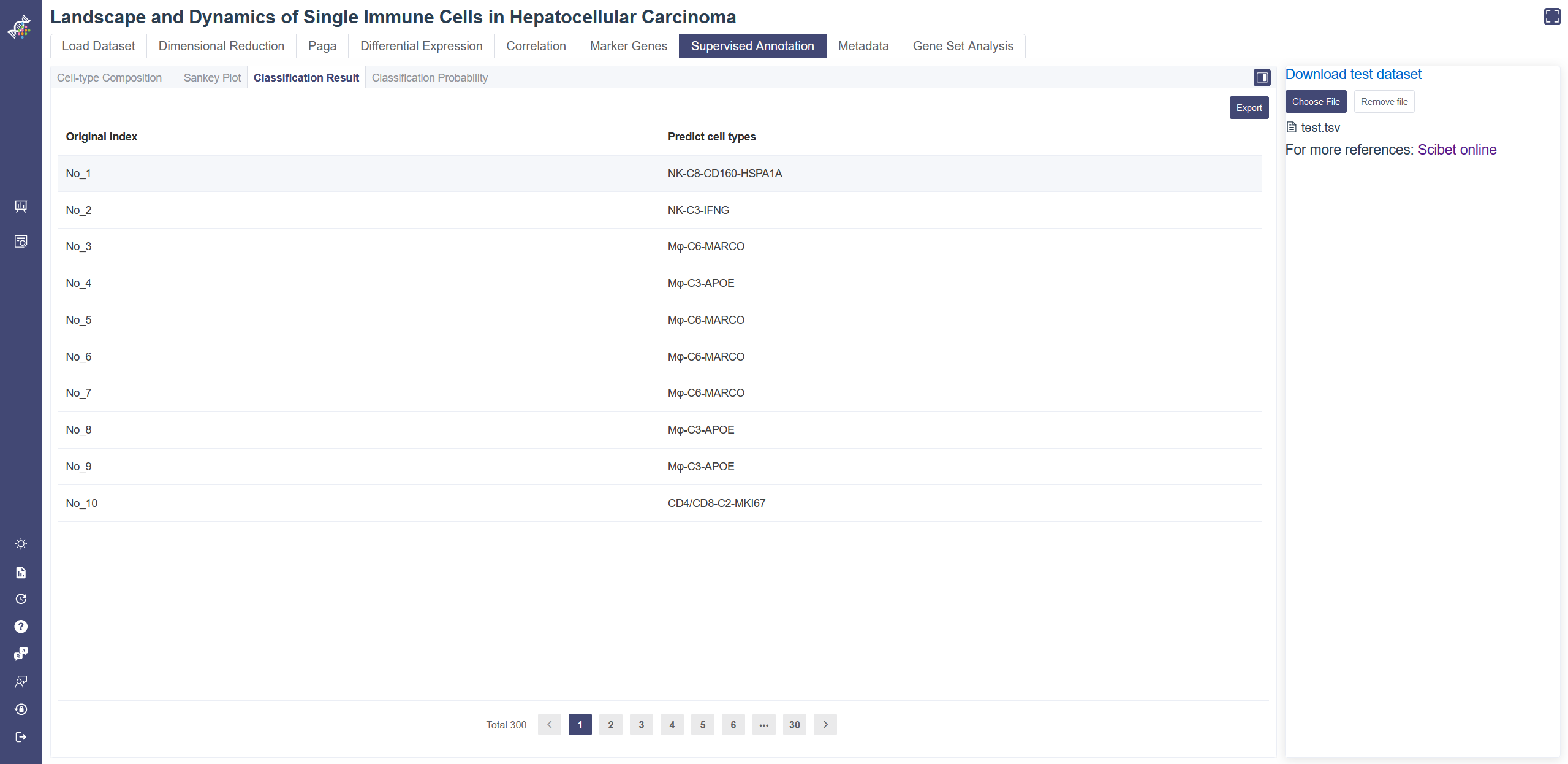
# 4.7.3 Classification Result
Click on the Classification Result tab shows the predicted cell type. Classification Result tab shows the predicted cell type of each cell uploaded. The result table can be downloaded via the Export button.
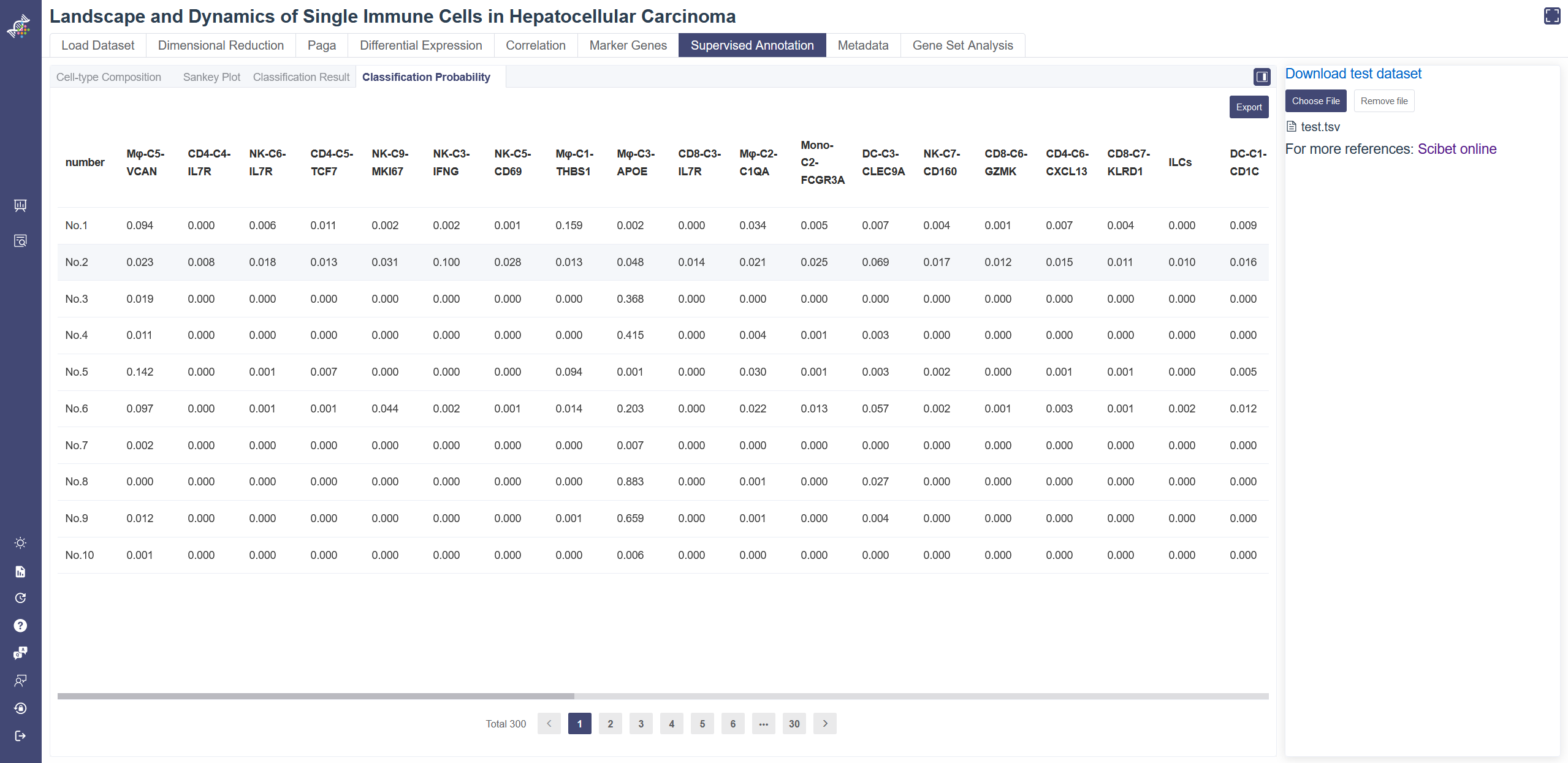
# 4.7.4 Classification Probability
Click on the Classification Probability tab shows the predicted probability of each cell type from the reference dataset at the single-cell level. Classification Probability tab shows the predicted probability of each cell type. The result table can be downloaded via the Export button.
# 4.8 Metadata
Cell metadata outlines the overall information of this dataset.
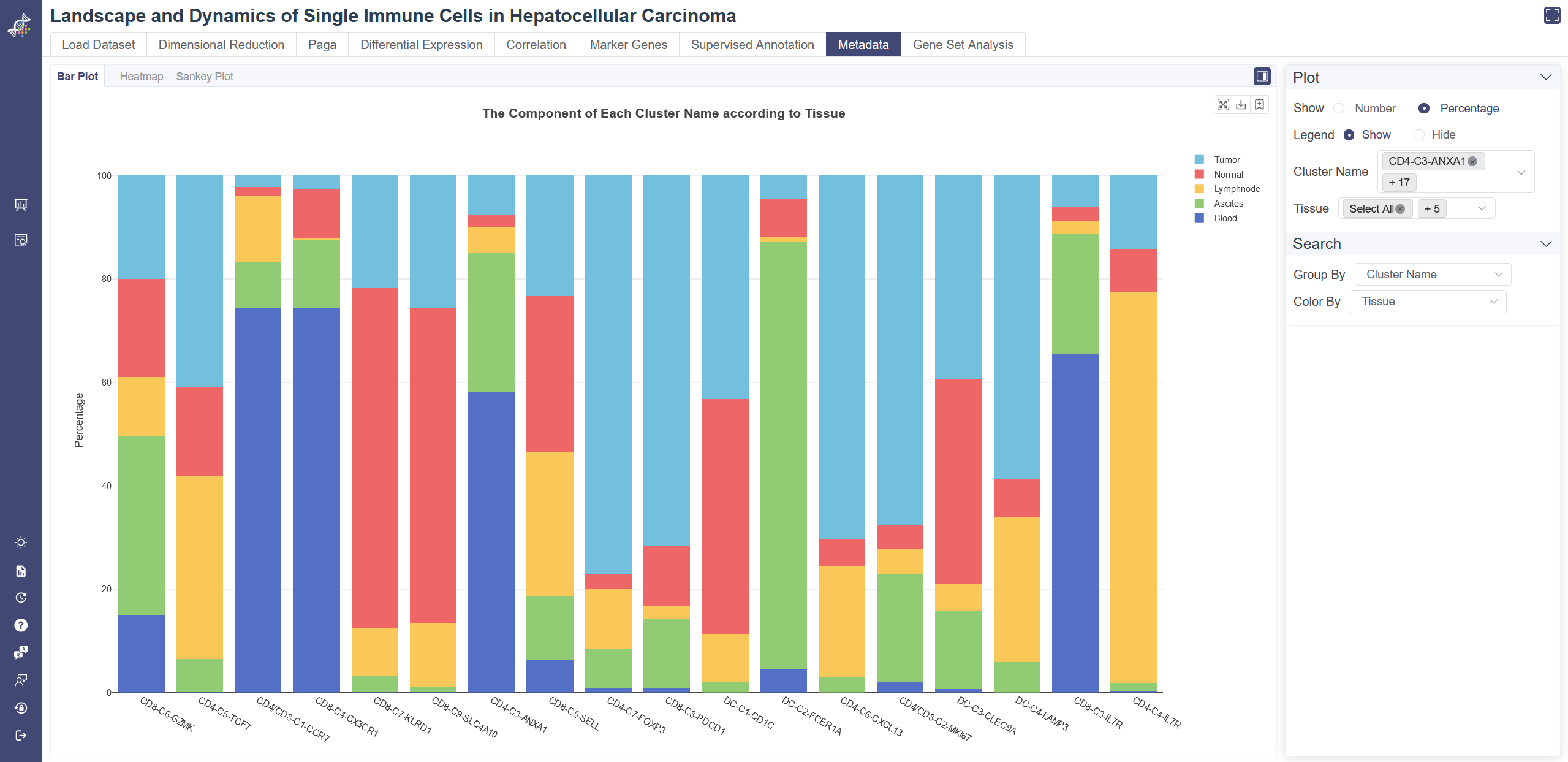
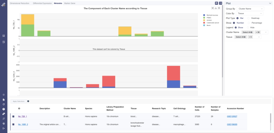
# 4.8.1 Bar Plot
Click on the Metadata page and in Bar Plot tab shows the bar plot of two groups of meta data. Choose one group of metadata in Group By drop-down list and another in Color By to explore two different properties. The visualizing two properties can be filtered on the right. The plot can be shown according to cell number or percentage of features. The legend of the data can be hidden by clicking on Hide. Listed information displays when the mouse over a bar.
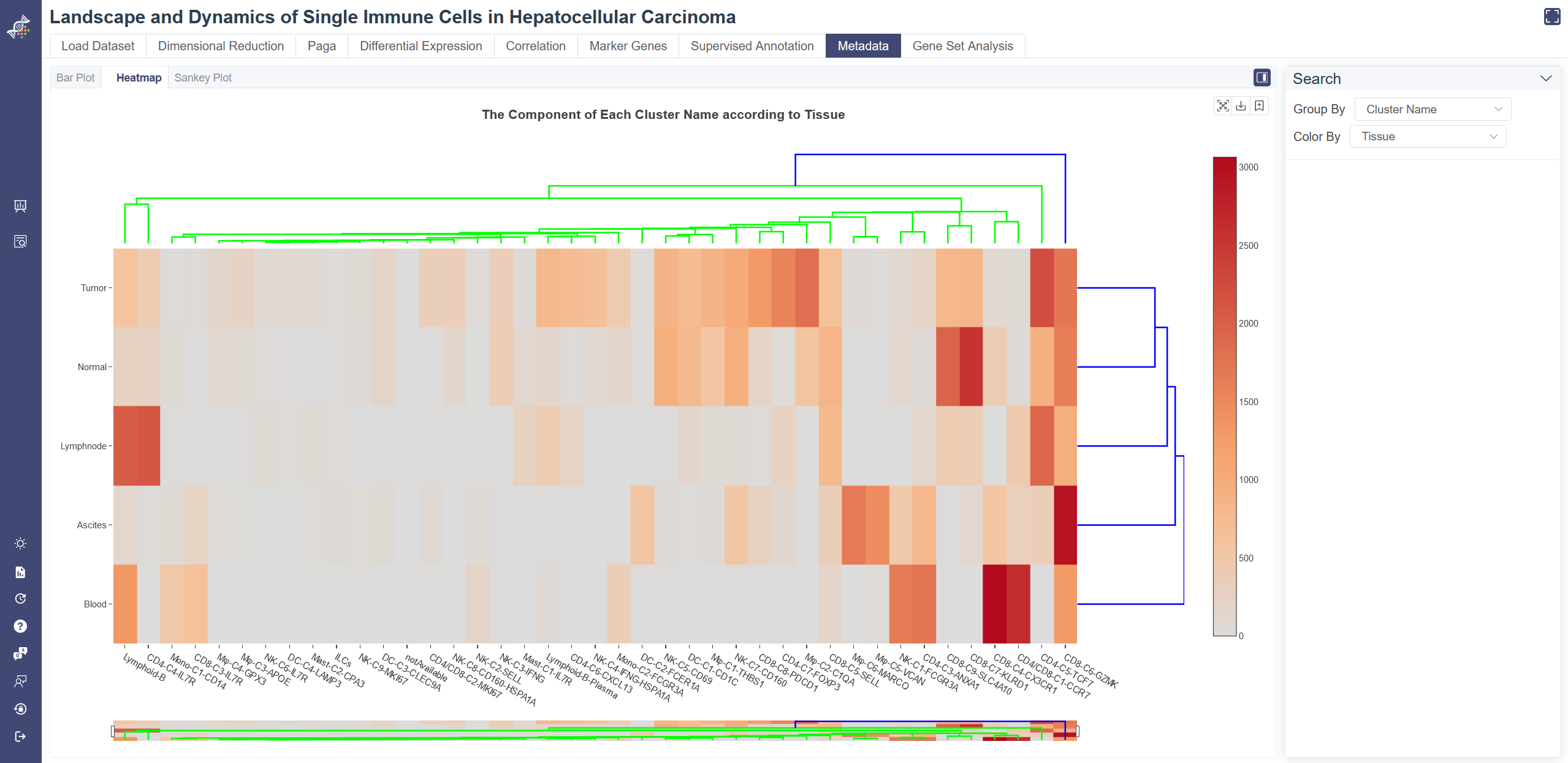
# 4.8.2 Heatmap
Click on Metadata page and in Heatmap tab shows the metadata heatmap. Choose one group of metadata in Group By drop-down list and another in Color By to explore two different properties. The percentage in row displays when the mouse over a bar. The dendrogram on the heatmap shows the similarity between groups and between genes. The shorter the link that connects two elements represents the more similarity.
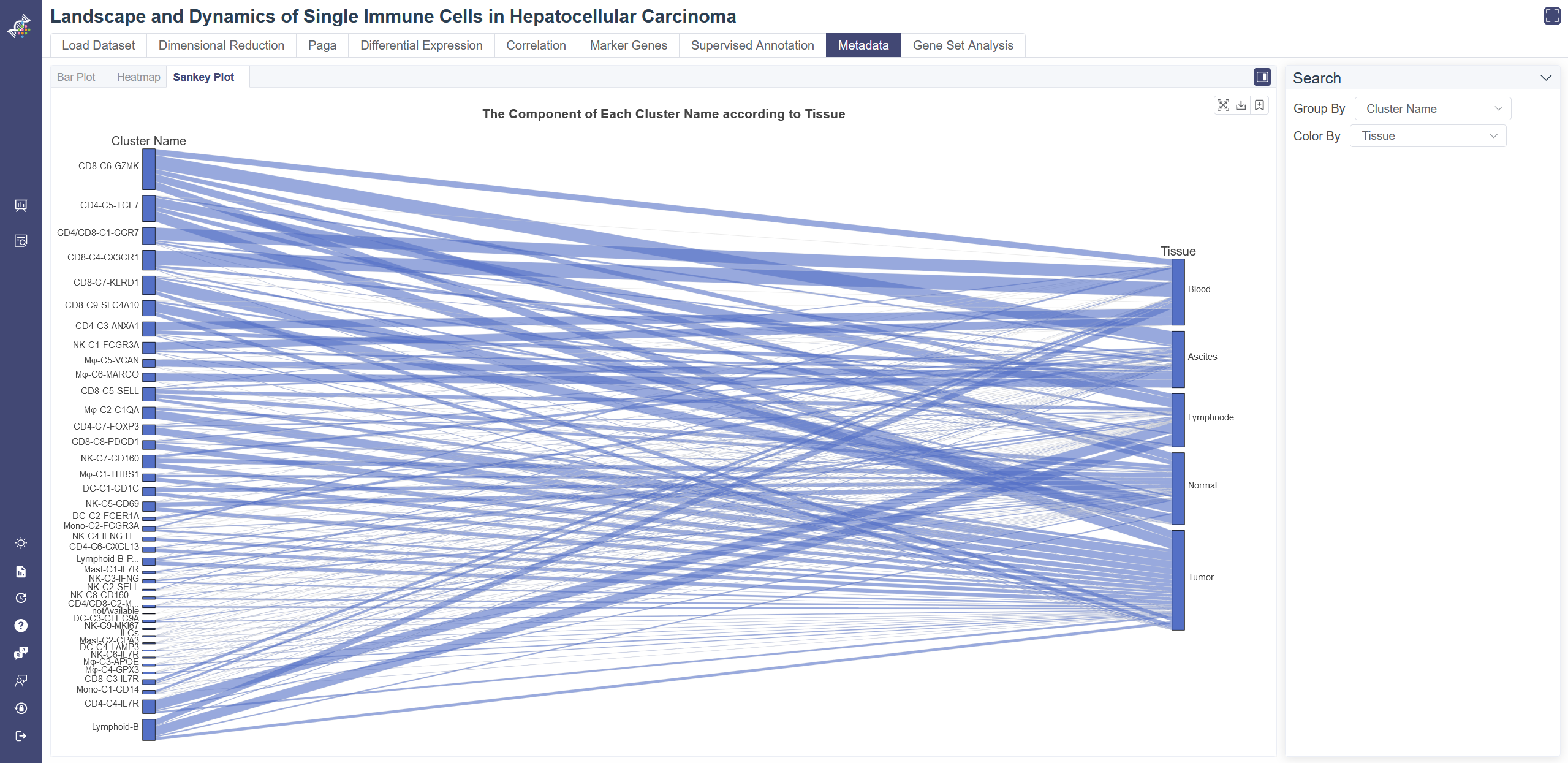
# 4.8.3 Sankey Plot
Click on the Sankey Plot tab shows the Sankey plot of the metadata. Sankey Plot tab shows the one-to-one correspondence of one meta group and another meta group.
# 4.9 Gene set Analysis
Gene Set Analysis is used to query GO enrichment results. For GO terms in the gene ontology database, we can find the top entries that are significantly enriched in the given gene list compared to all genes in the human or mouse genome, under the null hypothesis that the given genes were randomly sampled from the genome (no enrichment found). The less the p-value is, the more likely the entry will be the enriched one.
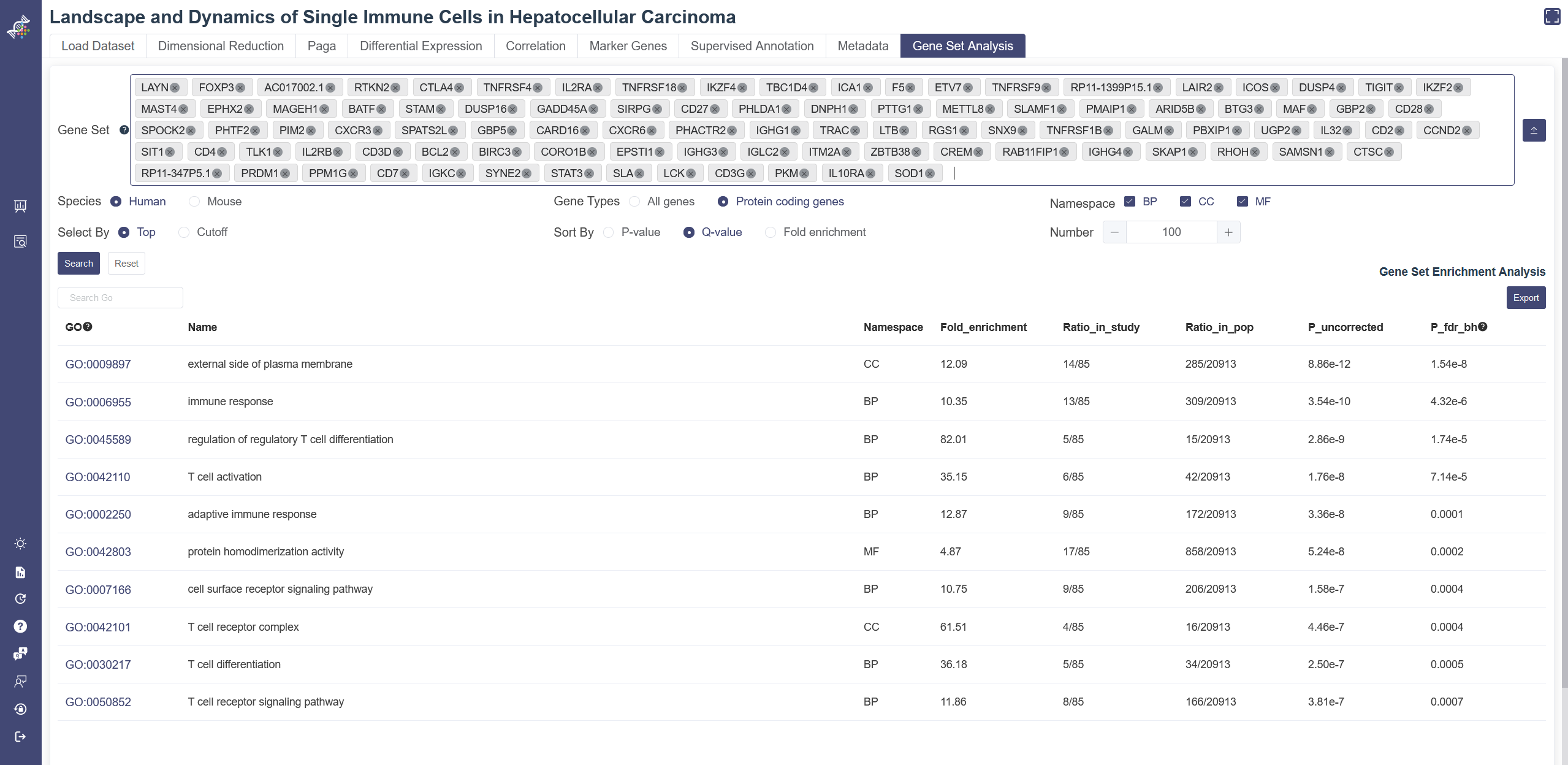
Click on Gene Set Analysis page to show the Gene Set Analysis function. Gene set can be inputted and selected in the input box or uploaded through the Import gene set button on the right of the input box. This upload function supports text files with one gene per line. View detail list button on Load Dataset page and Use these genes for gene set analysis button on the Marker Genes page may also import the result gene list to this function.
The results can be filtered or sorted through buttons below the gene set input box. Please note Species must be chosen correctly according to the gene set queried to get a reasonable conclusion. Namespace includes three types: molecular function(MF), cellular component(CC) and biological process(BP). P_fdr_bh means false discovery rate (Benjamini–Hochberg procedure), also named Q-value.
Click a GO item will lead you to the related page on QuickGO.
# 4.10 TCR
Only some datasets enable TCR function now. Select TCR in Cell Meta tab of search page and apply the filter, datasets with TCR information will show up. TCR information can be viewed via TCR tab in Dimensional Reduction Page and via TCR page in a single dataset.
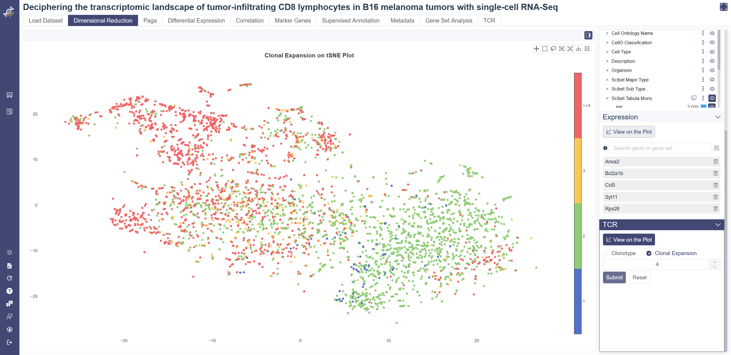
# 4.10.1 View TCR info on embedding
Click on View on the Plot of TCR tab on Dimensional Reduction page to visualize the TCR on embedding plot. Select the clonotype ID in the drop-down list and click on Add to List icon to view the corresponding TCR distribution. Click on Clonal Expansion, input high-cutoff of the clonotype size and click on Submit to show the enrichment of TCR on embedding. Click on Reset to clear all the input.
# 4.10.2 Clonal Type
Clonal Type ID, size, expansion and detailed sequencing data will show up as a table in Clonal Type tab. Filter displaying columns by selecting from the top-right drop-down list.
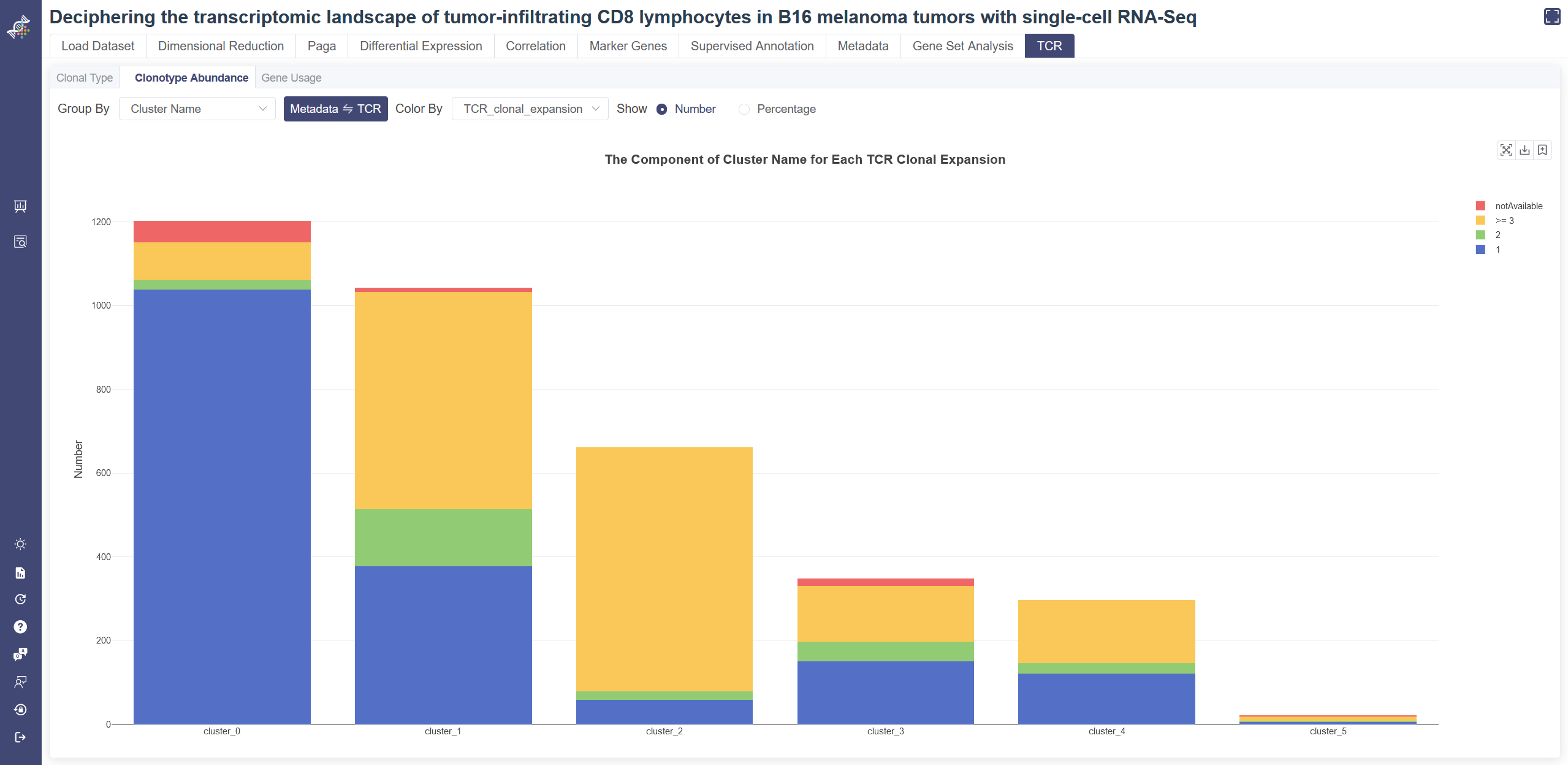
# 4.10.3 Clonotype Abundance
Click on the TCR page and in Clonotype Abundance tab shows the bar plot of TCR info and metadata. Choose one group of metadata in Group By drop-down list and one group of TCR info in Color By to explore two different properties. The plot can be shown according to cell number or percentage of features. Listed information displays when the mouse over a bar.
# 4.10.4 Gene Usage
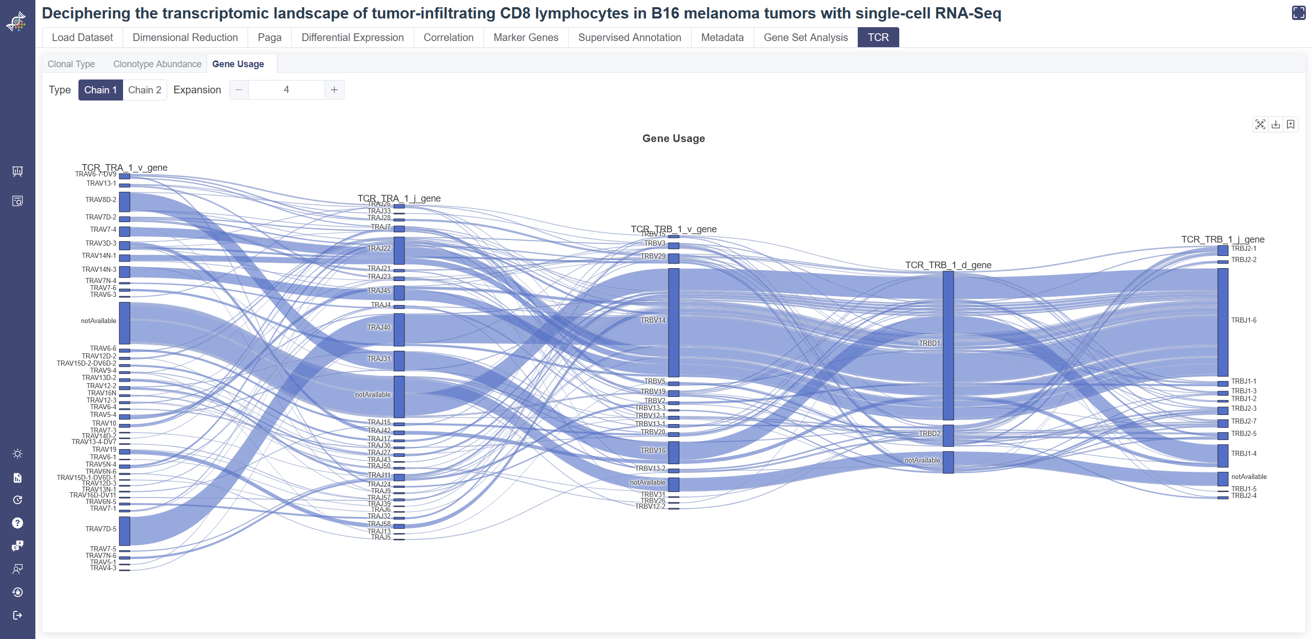
click on Gene Usage tab to switch to the Sankey plot. Sankey plot gives the pairing results of VDJ pairs of cells with TCR. The more the pairing between two genes, the greater the bandwidth is. Change the value of expansion to adjust the plot. Some cells may have second chain of TCR, and this part of information is shown in Chain 2. Click on Chain 2 to switch the type.
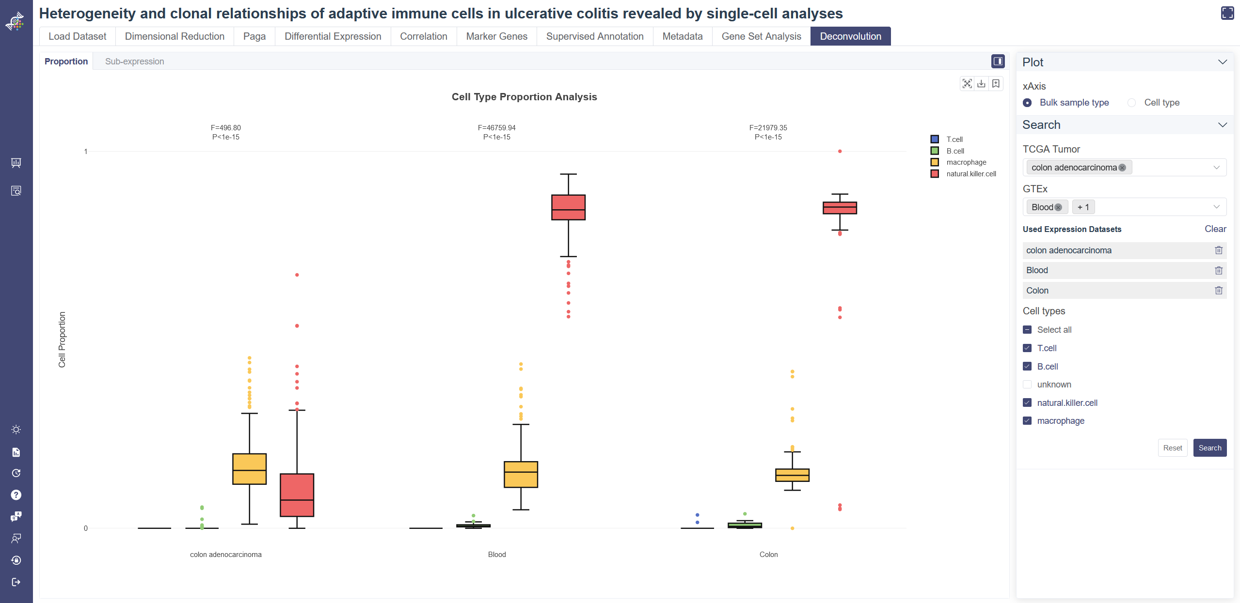
# 4.11 Deconvolution
Deconvolution module has been enabled to some datasets. Based on the inferred cell proportions in TCGA/GTEx bulk-RNA sample with a scRNA dataset as reference, the proportion comparison and cell type-level differential expression can be performed. Only some human datasets enable deconvolution function now. Select Deconvolution in Study Meta tab of search page and apply the filter, datasets with deconvolution function will show up.
Proportion Analysis: Visualize the proportion of each cell type selected with the interactive boxplot. Users can perform the quantitative comparison (ANOVA) of the proportion among cell types or TCGA/GTEx sub-datasets.
Sub-expression Analysis: Visualize the gene expression in each cell type selected with the interactive boxplot, and perform the cell type-level differential expression analysis. Similar with the Proportion Analysis, the differential expression analysis with ANOVA is also available.
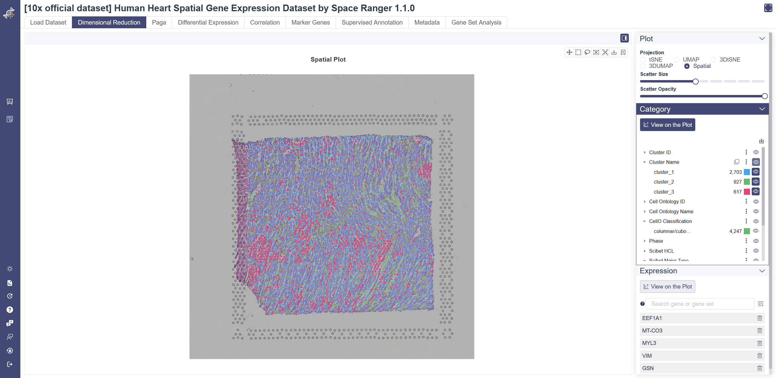
# 4.12 Spatial Transcriptome
Spatial Transcriptome data assign cell types to their locations in the histological sections. Only some of 10× official datasets contain spatial transcriptome data now. Select spatialTranscriptome in Study Meta tab of search page and apply the filter, datasets with spatial transcriptome data will show up.
View spatial transcriptome data: Click on Spatial on the right side of Dimensional Reduction page. Spatial information can also be related to different meta information on spatial plot. Click on some specific cell type to show its spatial distribution only. Specific gene expression level can also be displayed according to spatial distribution. Input and select genes in the expression box and click View on the Plot to show.
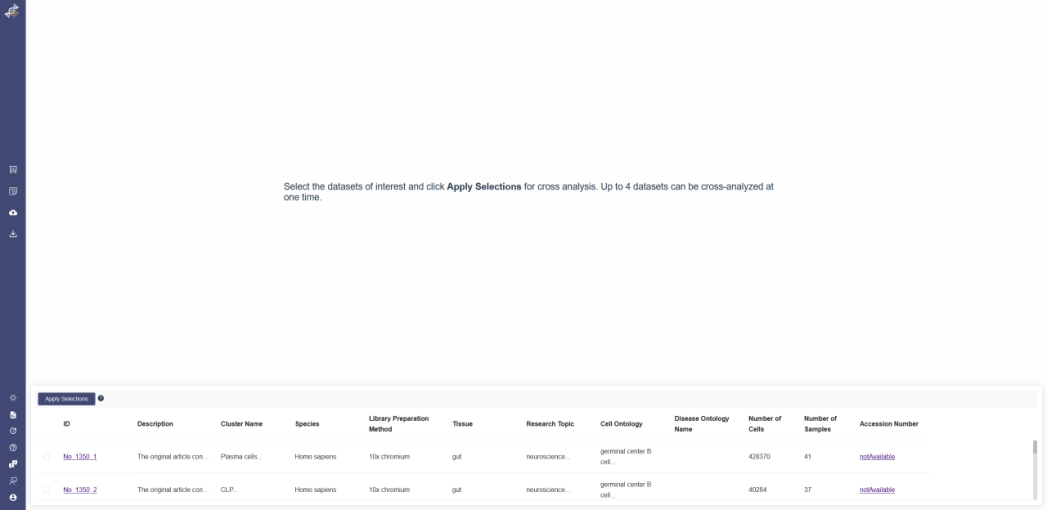
# 5. Cross-dataset Analysis
Dataset cross analysis function is used to compare the different datasets with visual interface. It’s support to compare up to 4 datasets with the same gene expression inputted. There are some attributes: gene expression, cell groups, cell clusters, the metadata and the Mark gene of each dataset can be viewed together to show the difference.
In search page, the datasets can be added to cart or removed. Clear Selection button is used to clear all the datasets in cart. And Cross Analysis is used to compare the selected data.
In the Cross Analysis page, the selected dataset is in the low part of screen, after selecting the datasets and clicking the Apply Selections button, the compared result can be viewed by Dimensional Reduction、Differential Expression、Metadata、and Marker Gene function;
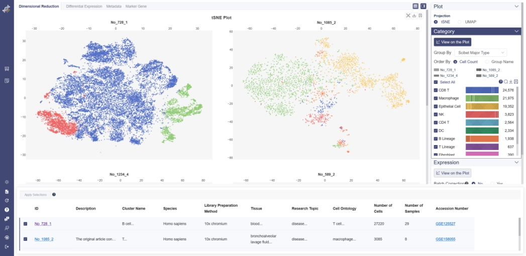
# 5.1 Dimensional Reduction
# 5.1.1 Projection
You can visualize the dimensional reduction plots only in 2D view in Cross Analysis. Methods can be toggled between t-SNE and UMAP.
Category View: Plot can be colored by different groups of annotation labels, e.g. Cluster Name, Cell ontology name.
# 5.1.2 Category
All cell clusters in the datasets are showed here. For different datasets, if the cell cluster names are identical, the cell group will added together. If there is unique cell group in one dataset, the other datasets don’t show the dimensional reduction plot. And all the cell group can be sorted by the cell count or the group name.
When the mouse pointer is on the cell cluster, there are information of this cluster will be showed. Click the check box on the left of the cell cluster name, the selected cell cluster will be hidden/shown;
Above the cell cluster name, there are 4 buttons from left to right:
(1) Notification: when the mouse pointer on it, it’s will showed a notification.
(2) Search: input the cell cluster name to search cell cluster;
(3) Save as image: save the category part as “png” format image;
(4) Add to report: add the category image to the report;
All group labels in the applied datasets are in the drop-down list here. If you choose one group label which is unique in one dataset, the other datasets don’t show the dimensional reduction plot. And all the cell clusters can be sorted by cell count or group name.
There is the legend of the plot.The representing pattern of each dataset displays above the legend of the data. Click on the check box on the left of the cell cluster name, the selected cell cluster will be hidden; When your mouse hovers on one cell cluster, the component of this cluster will be showed, it shows the cell number and fraction of each dataset. Click on the cell cluster to highlight the cluster in the plot. Click again to remove the highlight. Also, the color of each group is auto-generated to ensure that the color contrast of adjacent points in the chart is big enough for a good presentation.
# 5.1.3 Top-right Tool Bar

Hide dataset list: Click on the Hide dataset list button to hide the dataset list module for a better view of the plot.
Hide parameter panel: Click on the Hide parameter panel button to hide the parameter modules for a better view of the plot.
Reset Scale: Click on Reset Scale to go back to the default visualization of the plot.
Save as image: Export the current visualization of the canvas as a png file.
Add to report button is in the upper right corner of each downloadable image. Click the button to add the image to the report.
# 5.1.4 Expression
The gene expression level can color the embedding result. Use this function with marker genes would help distinguish the cell type of each cluster.
Click on the View on the Plot button in the Expression Module, the average expression of the five default genes shown below the input box will show up in the plot. The default genes can be deleted by clicking on the button on the right side of the gene or Delete all button. Input at least one gene and click Add to List, each dimension reduction plot of datasets will showed the average gene expression, if the plot is all dark-grey, it’s means no expression on this plot. When clicking the Batch Correction option is Yes, all the dataset will remove the batch effect of the gene. The Batch Correction option is only support to remove the batch effect of gene which all the datasets were contained in the analysis.
# 5.1.5 Left-side Tool Bar
Plot Theme: Click on Plot Theme icon to change the background color of the website. The background color is white by default and can be switched to black.
Save Report: Click on Save Report icon to download all the images added to report in batch.
# 5.2 Differential Expression
Differential Expression page of Cross Analysis facilitates to explore the gene expression difference between datasets. Violin plot and bubble plot visualizations are available on this page.
# 5.2.1 Violin Plot
Violin plot reflects the expression distribution of the gene or gene set across different cell groups of different datasets. F-test is used for each gene or gene set to identify whether it differentially expresses across all cell groups simultaneously, under the null hypothesis that the gene does not differentially express among all cell groups. The less the p-value is, the more likely the gene was differentially expressed. To determine whether the gene or gene set expression level of a group is different from the rest groups, OmniBrowser executes a t-test between a selected group of cells (experiment group) against the other cells (control group). F-test is conducted on the fly by default to evaluate statistical significance. The overall F and p values can be found on the top of a violin plot.
Generate violin plot: Input genes and click Add to List and explore the differential expression among datasets. Use batch correction function if needed. The violin plot can be visualized according to cell category or dataset, click on X Axis to switch the view. Groups can also be filtered from the legend on the Groups tab. Groups can be altered from the drop-down list in the Group By parameter.
# 5.2.2 Bubble Plot
Bubble Plot reflects the differential expression and the expressed fraction of every single gene across different cell groups from different datasets.
Click on Bubble Plot button in Plot Type to show Bubble Plot.
Generate Bubble Plot: Input and select the target gene or gene set then click on Search, you may also exchange the visualization of expression and expressed fraction to adjust the bubble plot. The gene expression and gene expressed fraction can be set to filter the cell group.Groups can be altered from the drop-down list in the Group By parameter. For comparing the gene expression in each of dataset, there is also batch correction option to remove the batch effect(for details of batch correction, please refer above).
# 5.3 Metadata
Cell metadata outlines the overall information across datasets.
# 5.3.1 Bar Plot
Click on the Metadata page and choose Bar as Plot Type shows the bar plot of two groups of metadata. Choose one group of metadata in Group By drop-down list and another in Color By to explore two different properties. The visualizing two properties can be filtered on the right. The plot can be shown according to cell number or percentage of features. The legend of the data can be hidden by clicking on Hide. Listed information displays when the mouse over a bar.
# 5.3.2 Heatmap
Click on the Metadata page and choose Heatmap as Plot Type shows the bar plot of two groups of metadata. Choose one group of metadata in Group By drop-down list and another in Color By, then choose one specific cell cluster to explore two different properties of the specific cell cluster. The dendrogram on the heatmap shows the similarity between groups and between genes. The shorter the link that connects two elements represents the more similarity.
# 5.4 Marker Genes
The Marker gene page shows marker genes of different clusters from different datasets. To determine each gene is a marker gene or not, a t-test or Wilcoxon-test is used to identify whether a gene differentially expresses between a selected group of cells (experiment group) against the other cells (control group). The less the p-value is, the more likely the gene will be a marker gene.
Search Marker Gene: Select a meta group in Meta Name and cluster(s) of interest. To filter positive or negative marker genes, please choose Statistic to be LogFC first and then select by Marker Type. Every click filters the result instantly. Marker genes of specific dataset or cluster can be filtered by clicking on the title of the marker gene table. LogFC represents the log of fold change.
Visualize via Bubble Plot: select the target gene or gene set then click on Plot. There are up to 10 marker gene can be selected on current page, and double spread selection is prohibited. Click Plot button and select the batch correction option to generate the bubble plot. The gene expression and gene expressed fraction can be set to filter the cell group. When the arguments on the right were modified, it’s need to re-generate the new plot.
# 6. Upload Dataset
Upload Dataset function is authorized to certain users. Users with permissions can find the two services on the sidebar. If you are interested in these functions, please contact us.
Upload Dataset page gives the user access to upload their datasets to OmniBrowser. You can easily compare your own data with published papers after uploading while still keep your data private.
Click on Upload Dataset icon to go to Upload List, which shows your previous uploaded dataset.
Click on the title of an uploaded file leads you directly to the dataset. Upload status will show the current process status after you submit a dataset.
The present permissions of each dataset displayed below the Permissions feature.
You can use the Delete button to remove an uploaded dataset. Only the uploader has access to delete the dataset.
You can easily manage data view and download permissions after you uploaded a dataset here.
If you want to change release permission, you can use the Permissions button in the Operations tab. The Modify Permission pop-up window will show up. For batch update permissions, please click on the dataset checkboxes then click on the Batch Update button.
Here you can set View permission and Download permission separately. View permission gives users access to explore visualizations and analysis results of the uploaded dataset. Download permission offers users access to download the uploaded dataset in h5ad format.
Four levels of authority are provided: private means only the uploader have access to this dataset, the company means users belong to the same company have access to this dataset, department means users belong to the same department have access to this dataset, public means all OmniBrowser users have access to this dataset. To upload a dataset, you need to click on the Upload new button on the Upload Dataset page, then fill in the Upload New Dataset sheet and upload your file. In the Upload New Dataset sheet, Title, Tissue, Species, Research topic, and Library method must be filled. After submit, you will be redirected to the Upload List page. Your dataset should be ready to explore when the status change to Success.
Currently, HDF5 file and TPM file formats are supported, please read the hint and help information on this page to ensure compatibility. If you need to upload a TPM file, please choose the Upload file type to be Other. If you upload the Marker gene file, please choose a test method before submitting it.
TPM format examples are provided via the Download example button.
You can use the dataset type field in the upper search box to have access to different datasets. The public dataset includes datasets curated by our bioinformatics team. The uploaded dataset includes datasets uploaded by users.
# 7 Download Dataset
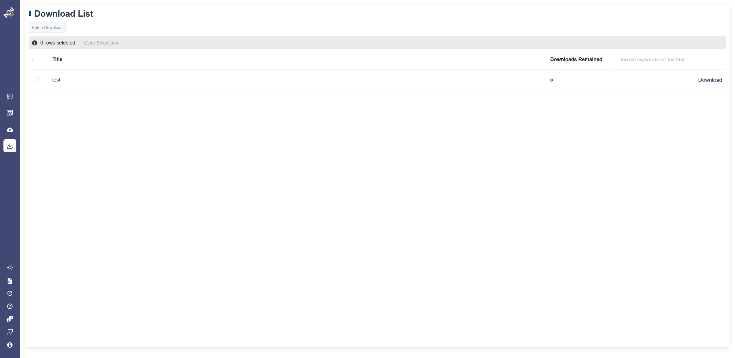
Download Dataset function is authorized to certain users. Users with permissions can find the two services on the sidebar. If you are interested in these functions, please contact us.
The Download Dataset shows the datasets user have access to download.
To download a dataset, click on the Download button on the right of each dataset.
Every dataset has five times download permission for each user. Downloads remained shows how many times are left for each dataset.
In the List view of Search Study, a dataset with download permission will also show a download icon on the right. Please contact us to apply for download permission if you are interested.